pacman::p_load(sf, tidyverse, tmap, spdep, funModeling, corrplot, ggpubr, rgdal,
               heatmaply, cluster, ClustGeo, reshape2, factoextra,
kableExtra)Take-Home Exercise 2: Regionalisation of Multivariate Water Point Attributes with Non-Spatially Constrained and Spatially Constrained Clustering Methods
1 Overview
The process of creating regions is called regionalisation. Regionalisation is a special kind of clustering which groups observations by incorporating both the statistical attributes and their spatial relationships. The spatial relationships are commonly modeled using contiguity and proximity considerations. As such, geographical constraints within a region are not limited to connectivity (i.e. there exists a path from one member to another member that leaves the region), and in certain contexts it make sense to relax connectivity and to impose other types of geographical constraints.
Regionalisation results in aggregation of basic spatial units into larger regions that preserve confidentiality, minimizes population differences and reduces the effects of outliers or inaccuracies in the data. This can help to facilitate visualisation and interpretation of information on the maps. [1]
2 Objectives
In this take-home exercise, we will regionalise Nigeria via conventional clustering without explicit spatial constraint i.e. hierarchical clustering, as well as clustering with explicit spatial constraints.
This will be performed by considering the following as potential clustering variables:
Total number of functional water points
Total number of non-functional water points
Percentage of functional water points
Percentage of non-functional water points
Percentage of main water point technology (i.e. hand pump)
Percentage of low usage water points (i.e. <1000)
Percentage of high usage water points (i.e. >=1000)
Percentage of rural water points
Percentage of water points that require payment
Percentage of crucial water points
3 The Data
In this exercise, we will analyse the data from Nigeria. There are 2 datasets used, as outlined in sections 3.1 and 3.2.
3.1 Aspatial Data
Data was downloaded from WPdx Global Data Repositories on 24 November 2022 in a csv format. The WPdx+ data set was filtered for “nigeria” in the column clean_country_name before downloading. There is a total of 95,008 unique water point records.
3.2 Geospatial Data
Nigeria Level-2 Administrative Boundary (also known as Local Government Area, LGA) polygon features GIS data was downloaded from geoBoundaries.
4 Getting The Data Into R Environment
4.1 Getting Started - Setting up the environment
In the following code chunk, p_load() from pacman package is used to install and load the following R packages into the R environment:
Handling spatial data
- sf, rgdal, and spdep
Handling attribute data (import, data wrangling, and visualising)
tidyverse, especially readr, ggplot2, and dplyr
rehshape2
Exploratory Data Analysis and Data Preparation
- funModeling
Generating choropleth maps
- tmap
Multivariate data visualisation and analysis
- coorplot, ggpubr, factoextra, and heatmaply
Cluster analysis
cluster
ClustGeo
Build tables and manipulate table styles
- kableExtra
4.2 Import Nigeria LGA boundary data into R environment
The following code chunk uses st_read() from sf package to import the geoboundaries shapefile into R and saves the imported geospatial data into a simple feature data table.
nga_sf <- st_read(dsn = "geodata",
               layer = "geoBoundaries-NGA-ADM2",
               crs = 4326)
nga_sf
The above printout shows the data is in wgs84 geographic coordinate system.
In the following, write_rds() of readr package is used to save the extracted sf data table into an output file in rds format. The following code chunk saves the output file in the geospatial folder.
write_rds(nga_sf,
          "geodata/nga_sf.rds")
4.3 Import csv file into R environment
We will use read_csv() to read the csv file as shown in the following code chunk.
wp <- read_csv("geodata/wpdx_nigeria.csv")The two fields #lat_deg and #long_deg are in decimal degree format. As a best guess, we will assume that the data is in wgs84 Geographic Coordinate System (i.e. the Geodetic coordinate system for World). We will then convert wpd data frame in to a simple feature data frame by using the following code chunk. Note that for data conversion, longitude should be supplied as the first argument in coords which is then followed by the argument for latitude.
wp <- st_as_sf(wp,
                   coords = c("#lon_deg", "#lat_deg"),
                   crs=4326)
wp
From the printout above, we can see that the data is in the format that we want, i.e. wgs84.
Similarly, we will use write_rds() from readr package to save the extracted sf data frame into an output file in rds format. The following code chunk saves the output file in the geospatial folder.
write_rds(wp,
          "geodata/wp.rds")
4.4 Data Wrangling for Nigeria LGA boundary data
4.4.1 Checking for duplicated area name
We will first sort the names of the LGAs in alphabetical order using sort(). We will then use duplicated() to retrieve all the shapeName that is duplicated and store them in a list. [Concise code chunk is adapted from Reference 2]
nga_sf <- read_rds("geodata/nga_sf.rds")
nga_sf <- (nga_sf[order(nga_sf$shapeName), ])
duplicate_area <- nga_sf$shapeName[nga_sf$shapeName %in%
                                nga_sf$shapeName[duplicated(nga_sf$shapeName)] ]
duplicate_area
[1] "Bassa" "Bassa" "Ifelodun" "Ifelodun" "Irepodun" "Irepodun"
[7] "Nasarawa" "Nasarawa" "Obi" "Obi" "Surulere" "Surulere"We will add 2 columns for longitude and latitude which we will use to check the LGA names for the duplicated rows using latlong.net. The following code chunk adds columns for longitude and latitude.
nga_sf$longitude <- map_dbl(nga_sf$geometry, ~st_centroid(.x)[[1]])
nga_sf$latitude <- map_dbl(nga_sf$geometry, ~st_centroid(.x)[[2]])
Based on the results from latlong.net, the table below shows the index and the actual area name.
| Index in nga table | Actual area name |
|---|---|
| 94 | Bassa (Kogi) |
| 95 | Bassa (Plateau) |
| 304 | Ifelodun (Kwara) |
| 305 | Ifelodun (Osun) |
| 355 | Irepodun (Kwara) |
| 356 | Irepodun (Osun) |
| 518 | Nassarawa |
| 546 | Obi (Benue) |
| 547 | Obi (Nasarawa) |
| 693 | Surulere (Lagos) |
| 694 | Surulere (Oyo) |
We will then rectify the incorrect names in nga table by accessing the relevant rows by their indexes as shown in the following code chunk.
nga_sf$shapeName[c(94,95,304,305,355,356,519,546,547,693,694)] <- c(
                               "Bassa (Kogi)", "Bassa (Plateau)",
                               "Ifelodun (Kwara)", "Ifelodun (Osun)",
                               "Irepodun (Kwara)", "Irepodun (Osun)",
                               "Nassarawa",
                               "Obi (Benue)", "Obi(Nasarawa)",
                               "Surulere (Lagos)", "Surulere (Oyo)")
We will then check if all duplicated area names have been successfully rectified. We perform this by checking if there is anymore duplicated records using duplicated().
nga_sf$shapeName[nga_sf$shapeName %in% nga_sf$shapeName[duplicated(nga_sf$shapeName)] ]character(0)From the results, we can see that there is no more duplicated names observed.
We then remove the columns we have just created to assist us in renaming the LGAs using the following code chunk.
nga_sf <- nga_sf[-c(7:8)]5 Data Wrangling for Nigeria water point data
In this section, we will review several variables provided in the water point data that was downloaded from WPdx Global Data Repositories to be considered for clustering variables. To perform regionalisation of the LGAs based on the water points, we are interested in the following attributes for the water points:
How accessible is the water point, i.e. do we need to travel long distances to get to the water point?
How many people can be served by the water point?
Are the water points still functioning?
Are the water points using hand pump technology (i.e. the most common technology for water supply in rural communities)?
Are there fees incurred for using the water point?
5.1 Loading data and recoding NA values into string for status_clean field
We will first load the data in rds format. In the following code chunk, we will also rename the column from #status_clean to status_clean for easier handling in subsequent steps. In addition, replace_na() is used to recode all the NA values in status_clean into unknown.
wp <- read_rds("geodata/wp.rds") %>%
    rename('status_clean' = '#status_clean') %>%
    mutate(status_clean = replace_na(status_clean, "unknown"))
5.2 EDA for distance attributes
We can plot multiple histograms together in the same plot to reveal the distribution of various variables. We can do this by first creating the individual histograms and then using ggarange() function from ggpubr package to group these histograms together.
There are 5 distance variables in wp, namely, distance to primary road, distance to secondary road, distance to tertiary road, distance to city, and distance to town. We are interested in understanding the distances to travel to reach the water points as we postulate that water points that are more accessible would likely to be used more frequently, be better maintained, and remain functional. We will plot the histograms for these variables using the following code chunk.
primary <- ggplot(data=wp,
                  aes(x=`#distance_to_primary_road`)) +
    geom_histogram(bins=20,
                   color="black",
                   fill="light blue")

secondary <- ggplot(data=wp,
                  aes(x=`#distance_to_secondary_road`)) +
    geom_histogram(bins=20,
                   color="black",
                   fill="light blue")

tertiary <- ggplot(data=wp,
                  aes(x=`#distance_to_tertiary_road`)) +
    geom_histogram(bins=20,
                   color="black",
                   fill="light blue")

city <- ggplot(data=wp,
                  aes(x=`#distance_to_city`)) +
    geom_histogram(bins=20,
                   color="black",
                   fill="light blue")

town <- ggplot(data=wp,
                  aes(x=`#distance_to_town`)) +
    geom_histogram(bins=20,
                   color="black",
                   fill="light blue")

ggarrange(primary, secondary, tertiary, city, town,
          ncol = 3,
          nrow = 2)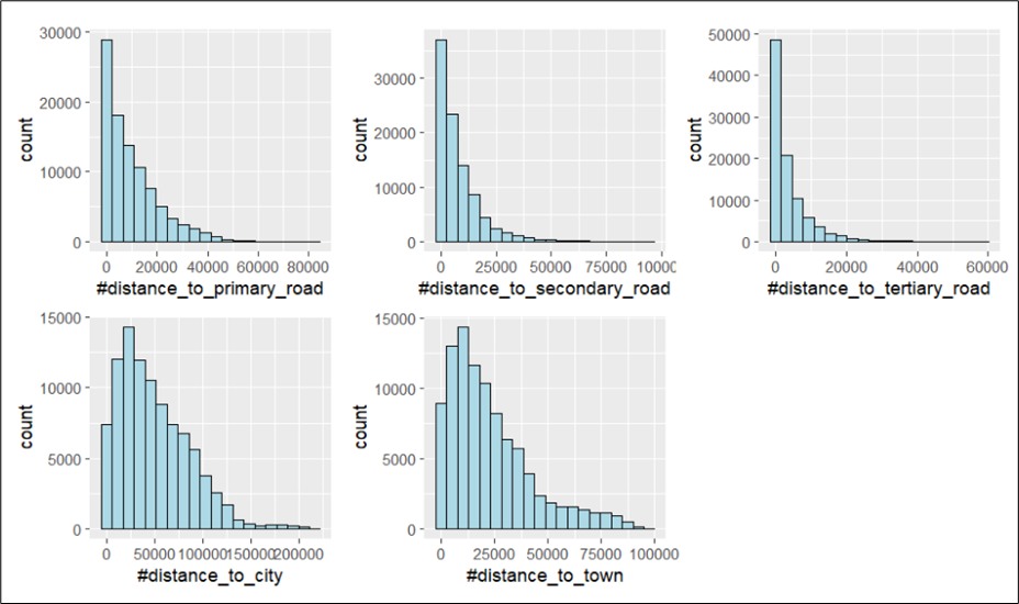
According to the data source for the description of these variables, the distances are measured in km. However, it is unlikely that the distances to reach the water points can go up to minimally 60,000 km (distance_to_tertiary_road). It is likely that some distances in the data set were recorded in metres and others in kilometers. As we are unable to tell the unit of measurement used for each water point record, we will not be using any of these distance variables in our subsequent analysis.
5.3 EDA for status of water points
We are also interested in understanding the functionality of the water points, i.e. whether they are still functioning or not.
In the following code chunk, we use freq() to determine the number of records in each classification for the status of the water points.
freq(data = wp,
     input = 'status_clean')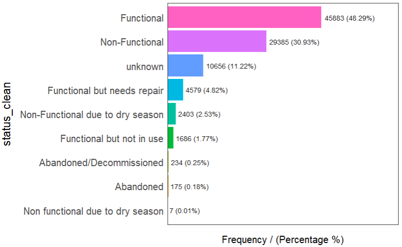
It can be observed that there are different classification within functional water points and within non-functional water points. For instance, for non-functional water points, they may be categorised as ‘non-functional’, or as ‘non-functional due to dry season’. As such, we need to re-group the data to create 2 separate dataframes each containing either type of functional water points.
In addition, we will treat abandoned water points as non-functional.
5.3.1 Extracting functionality of water points
In this section, we will extract the water point records by using classes in status_clean field. In the following code chunks, filter() from dplyr is used to select functional water points.
wp_functional <- wp %>%
    filter(status_clean %in%
               c("Functional",
                 "Functional but not in use",
                 "Functional but needs repair"))
wp_nonfunctional <- wp %>%
filter(status_clean %in%
c("Abandoned/Decommissioned",
"Abandoned",
"Non-Functional due to dry season",
"Non-Functional",
"Non functional due to dry season"))wp_unknown <- wp %>%
filter(status_clean == "unknown")To check whether the filtering was performed correctly, we can run the following code chunks and reconcile the number of records with that in Section 4.5.2.
table(wp_functional$status_clean)table(wp_nonfunctional$status_clean)table(wp_unknown$status_clean)The output shows that filtering was performed successfully.
5.4 Extracting water points with hand pump technology
In the following code chunk, we want to see what are the types of water point technology listed in the data. From the output figures, we can also observe that the water point technology is not recorded for some of the records.
table(wp$`#water_tech_category`)From the results, we can tell that there are approximately 89% of the water points with the water technology information being recorded. Since this represents the majority (i.e. more than 80%), it remains to be a suitable variable to be used for subsequent analysis.
We can also see that the majority of the water points are built based on hand pump technology (approximately 62%). As such, we will want to extract water points that have this main water point technology (i.e. hand pump). Since there is only 1 category for hand pumps, we will extract water points with hand pump technology by specifying “Hand Pump”.
wp_handpump <- wp %>%
    filter(`#water_tech_category` %in% "Hand Pump")
5.5 Extracting water points by their usage capacity
We will classify the usage capacity of water points as low if the maximum number of users that can be served by the water point is below 1000 and classify as high if the maximum number of users that can be served by the water point is 1000 and above.
We will first check whether the usage capacity is specified for all the water points. From the results, we are able to tell that the usage capacity for all water points are recorded.
nrow(subset(wp, wp$usage_capacity < 1000))
nrow(subset(wp, wp$usage_capacity >= 1000))
In the following code chunk, we will extract water points with low and high usage capacity respectively.
wp_low_usage <- wp %>%
    filter(usage_capacity < 1000)
wp_high_usage <- wp %>%
    filter(usage_capacity >= 1000)
5.6 Extracting rural water points
We also expect that LGAs would differ by the number of water points that are in rural areas and in the urban areas. Likewise, we will first determine whether all water point records are classified as either urban or rural.
table(wp$is_urban)We can see that the results add up to 95,008 which is the total number of records. Hence, there is no missing field for this column. Since the classification is binary, we will extract just one of them - rural.
In the following code chunk, we will extract the water points that are rural.
wp_rural <- wp %>%
    filter(is_urban %in% FALSE)
5.7 Extracting water points with more than 50% crucialness_score
Another variable that we found useful for our analysis is the crucialness_score which is the ratio of likely current users to the total local population within a 1km radius of the water point. This can also serve as a substitute for the distance variables which we have identified as unsuitable for analysis previously in section 5.2.
In the following code chunk, we wanted to identify the number of water points with no crucialness_score recorded. From the results, we see that there are 6879 records (approximately 7% of all records) with missing crucialness score. Since the majority of the records have crucialness score, we can proceed with subsequent analysis.
sum(is.na(wp$crucialness_score))In the following code chunk, we will extract water points that are located within 1km of at least half of the total population, i.e. crucialness_score >= 0.5.
wp_crucial <- wp %>%
    filter(crucialness_score >=0.5)
5.8 Extracting water points that do not require payment
We also expect LGAs to differ regionally based on whether the water points require payment for use. Likewise, we will first look at the different categories within this column. The results show that the records can be classified into - NA (11%), Yes (7%), and No (82%).
freq(data = wp,
     input = '#pay')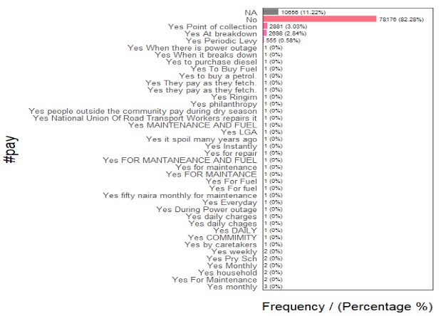
Although we have 11% missing data, the majority of the records are populated. Hence, we will proceed to using this variable by extracting water point records that do not require payment.
wp_pay <- wp %>%
    filter(`#pay` == "No")
5.9 EDA for water points based on their pressure score
We are also interested in understanding whether the water points are stressed, i.e. serving more people than what it was built to support. For this, we can use the variable on pressure_score which is calculated based on the ratio of the number of people assigned to that water point over the theoretical maximum population which can be served based on the technology. Thus, a pressure_score of more than 100 implies that the water point is serving more than the recommended maximum.
In the following code chunk, we determine the number of water points that are serving below 80% of its recommended maximum capacity and those that are serving more than 80% of its recommended maximum capacity.
nrow(subset(wp, wp$pressure_score < 80)) / 95008 * 100
nrow(subset(wp, wp$pressure_score >= 80)) / 95008 * 100
The results show that there are missing records, along with 92.6% of water points serving below 80% of its maximum and 0.1% serving above 80% of its maximum. Since we are only certain that 0.1% serve more than 80% of its maximum, this number of water points is too little for further analysis. Hence, we will not use this variable for subsequent analysis.
6 Performing Point-in-Polygon Count
We want to find the number of water points in each LGA - including total, functional, non-functional, unknown functionality status, hand pump technology, low usage capacity, high usage capacity, and rural water points. This is performed in the following code chunk. First, it identifies the functional water points in each LGA by using st_intersects(). Next, length() is used to calculate the number of such water points that fall inside each LGA.
nga_wp <- nga_sf %>%
    mutate(`total_wp` = lengths(
        st_intersects(nga_sf, wp))) %>%
    mutate(`wp_functional` = lengths(
        st_intersects(nga_sf, wp_functional))) %>%
    mutate(`wp_nonfunctional` = lengths(
        st_intersects(nga_sf, wp_nonfunctional))) %>%
    mutate(`wp_unknown` = lengths(
        st_intersects(nga_sf, wp_unknown))) %>%
    mutate(`wp_handpump` = lengths(
        st_intersects(nga_sf, wp_handpump))) %>%
    mutate(`wp_low_usage` = lengths(
        st_intersects(nga_sf, wp_low_usage))) %>%
    mutate(`wp_high_usage` = lengths(
        st_intersects(nga_sf, wp_high_usage))) %>%
    mutate(`wp_rural` = lengths(
        st_intersects(nga_sf, wp_rural))) %>%
    mutate(`wp_pay` = lengths(
        st_intersects(nga_sf, wp_pay))) %>%
    mutate(`wp_crucial` = lengths(
        st_intersects(nga_sf, wp_crucial)))
6.1 Transforming the projection from wgs84 to EPSG: 26391
In this section, we will transform the geographic coordinate system to the projected coordinate system. This is because in the subsequent section, we will be performing adaptive distance weighting and geographic coordinate system is not appropriate for such steps.
In the following code chunk, we use st_transform() of sf package to perform the projection transformation.
nga_wp <- st_transform(nga_wp,
                       crs = 26391)
6.2 Saving the Analytical Data Table
Now that we have the tidy sf data table, we will save it in rds format for subsequent analysis.
write_rds(nga_wp, "geodata/nga_wp.rds")6.3 Performing Feature Engineering
We will tabulate the proportion of each type of water points against the total number of water points in each LGA. In the following code chunk, mutate() from dplyr package is used to derive these additional fields.
nga_wp <- read_rds("geodata/nga_wp.rds")
nga_wp <- nga_wp %>%
    mutate(pct_functional = wp_functional/total_wp) %>%
    mutate(pct_nonfunctional = wp_nonfunctional/total_wp) %>%
    mutate(pct_handpump = wp_handpump/total_wp) %>%
    mutate(pct_lowusage = wp_low_usage/total_wp) %>%
    mutate(pct_highusage = wp_high_usage/total_wp) %>%
    mutate(pct_rural = wp_rural/total_wp) %>%
    mutate(pct_pay = wp_pay/total_wp) %>%
    mutate(pct_crucial = wp_crucial/total_wp)
As we performed a division in the previous step, we will want to check if there is any NA values in the columns for pct_functional and pct_nonfunctional.
if (any(is.na(nga_wp$pct_functional))){print("NA values in pct_functional")}[1] "NA values in pct_functional"if (any(is.na(nga_wp$pct_nonfunctional))){print("NA values in pct_nonfunctional")}[1] "NA values in pct_nonfunctional"From the printout, we are able to tell that there are NA values in both pct_functional and pct_nonfunctional columns.
This is likely due to 0 total water points in these LGAs. If we impute 0 into the pct_nonfunctional column for these LGAs with 0 water points, we may incorrectly regard these LGAs to have very low proportion of non-functional water points and lead to an incorrect analysis when performing spatial distribution analysis. As such, we will exclude LGAs with 0 water points from our analysis.
In the following code chunk, we want to calculate the number of LGAs with no water points. This is done by using nrow() to calculate the total number of LGAs in nga_wp and in nga_wp_filter.
nrow(subset(nga_wp, total_wp == 0))[1] 13From the printout, we can see that there are 13 LGAs will 0 water points.
In the following code chunk, we retrieve only rows with non-zero total number of water points by using subset() and exclude the LGAs with 0 water points.
nga_wp_filter <- subset(nga_wp, total_wp != 0)In addition, we also want to exclude LGAs whereby the status of all their water points are unknown. This is because we are unable to deduce the number of functional or non-functional water points in these LGAs. Also, the values in the pct_functional and pct_nonfunctional columns for these LGAs are 0 which will affect our subsequent analysis like what we have discussed earlier.
Likewise, we calculate the number of such LGAs first.
nrow(subset(nga_wp_filter, total_wp == wp_unknown))[1] 8For the printout, we can see that there are 8 LGAs whereby the status of all their water points are unknown.
In the following code chunk, we use filter() to exclude these LGAs.
nga_wp <- subset(nga_wp, total_wp != wp_unknown)7 Correlation Analysis
It is important for us to ensure that cluster variables are not highly correlated when we perform cluster analysis. This is because we do not want to give extra weight to variables that are highly correlated.
We will use corrplot.mixed() function of corrplot package to visualise and analyse the correlation between the input variables. In the following, we have used data.frame() to transform the nga_wp_filter simple feature to a data.frame so that the geometry field is not being evaluated in the correlation plot.
filter <- select(as.data.frame(nga_wp), c(8,9,17:24))
cluster_vars.cor = cor(filter)
corrplot.mixed(cluster_vars.cor,
               lower = "ellipse",
               upper = "number",
               tl.pos = "lt",
               diag = "l",
               tl.col = "black")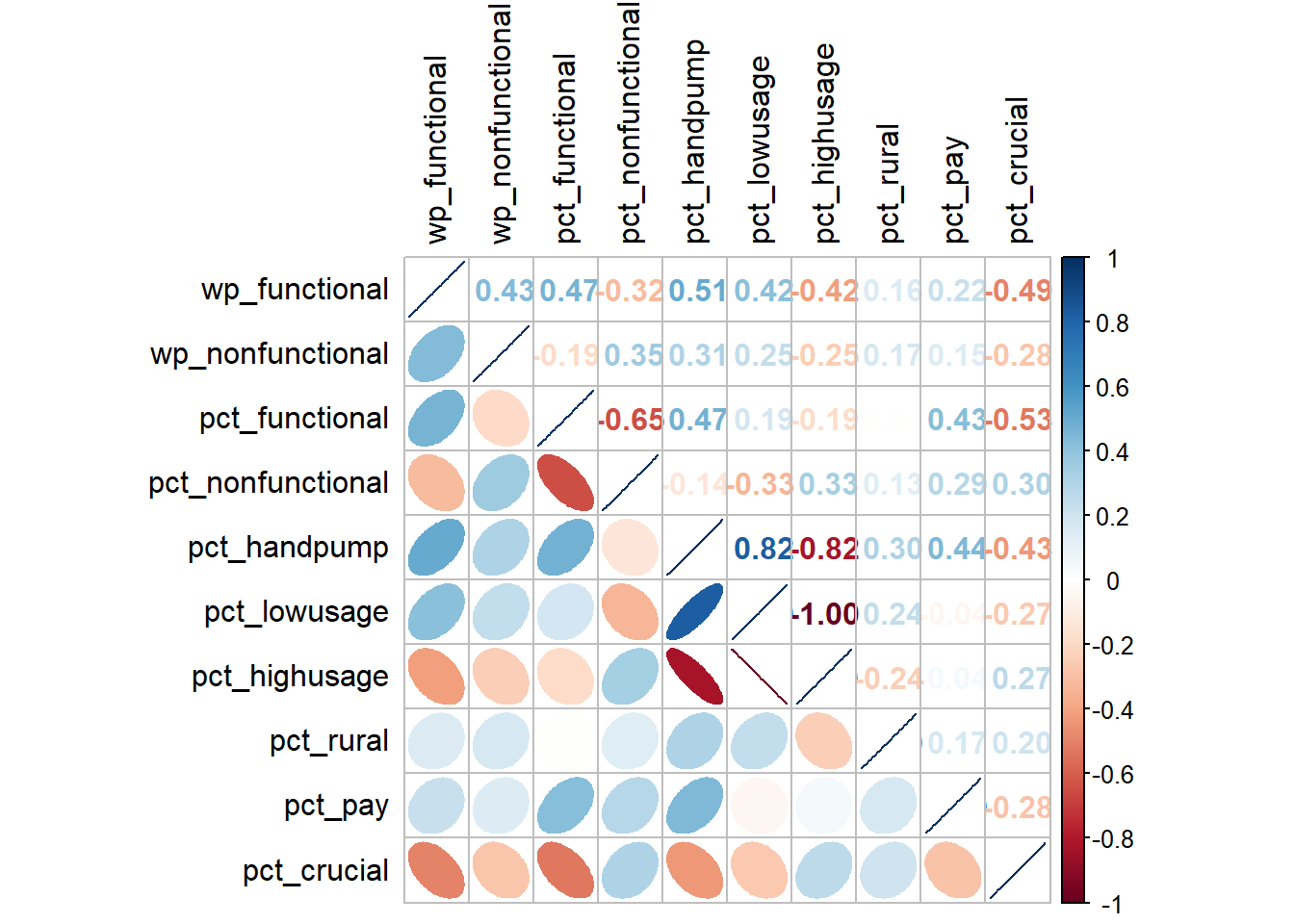
In the correlation plot above, the fatter the ellipse is, the more weakly correlated the 2 variables are. And the more the plot looks like a line, the more strongly correlated the 2 variables are.
The correlation plot above shows that pct_handpump, pct_lowusage, pct_highusage are highly correlated. This suggest that only one of them should be used in the cluster analysis. In the subsequent analysis, we will only keep pct_handpump out of the 3 variables.
We can visualise the how the clustering variables vary for the LGAs by plotting choropleth maps as shown in the following code chunk.
wp_fun_map <- tm_shape(nga_wp) +
  tm_fill(col = "wp_functional",
          n = 5,
          style = "jenks",
          title = "Num of Fuctional") +
  tm_borders(alpha = 0.5) +
    tm_layout(legend.text.size = 0.5)

wp_nonfun_map <- tm_shape(nga_wp) +
  tm_fill(col = "wp_nonfunctional",
          n = 5,
          style = "jenks",
          title = "Num of Non-Functional") +
  tm_borders(alpha = 0.5) +
    tm_layout(legend.text.size = 0.5)

pct_fun_map <- tm_shape(nga_wp) +
  tm_fill(col = "pct_functional",
          n = 5,
          style = "jenks",
          title = "PCT Fuctional") +
  tm_borders(alpha = 0.5) +
    tm_layout(legend.text.size = 0.5)

pct_nonfun_map <- tm_shape(nga_wp) +
  tm_fill(col = "pct_nonfunctional",
          n = 5,
          style = "jenks",
          title = "PCT Non-Functional") +
  tm_borders(alpha = 0.5) +
    tm_layout(legend.text.size = 0.5)

lowusage_map <- tm_shape(nga_wp) +
  tm_fill(col = "pct_lowusage",
          n = 5,
          style = "jenks",
          title = "PCT Low Usage") +
  tm_borders(alpha = 0.5) +
    tm_layout(legend.text.size = 0.5)

rural_map <- tm_shape(nga_wp) +
  tm_fill(col = "pct_rural",
          n = 5,
          style = "jenks",
          title = "PCT Rural") +
  tm_borders(alpha = 0.5) +
    tm_layout(legend.text.size = 0.5)

pay_map <- tm_shape(nga_wp) +
  tm_fill(col = "pct_pay",
          n = 5,
          style = "jenks",
          title = "PCT Need Payment") +
  tm_borders(alpha = 0.5) +
    tm_layout(legend.text.size = 0.5)

crucial_map <- tm_shape(nga_wp) +
  tm_fill(col = "pct_crucial",
          n = 5,
          style = "jenks",
          title = "PCT Crucial") +
  tm_borders(alpha = 0.5) +
    tm_layout(legend.text.size = 0.5)

tmap_arrange(wp_fun_map, wp_nonfun_map, pct_fun_map, pct_nonfun_map, lowusage_map,
             rural_map, pay_map, crucial_map,
             ncol=2, nrow = 4)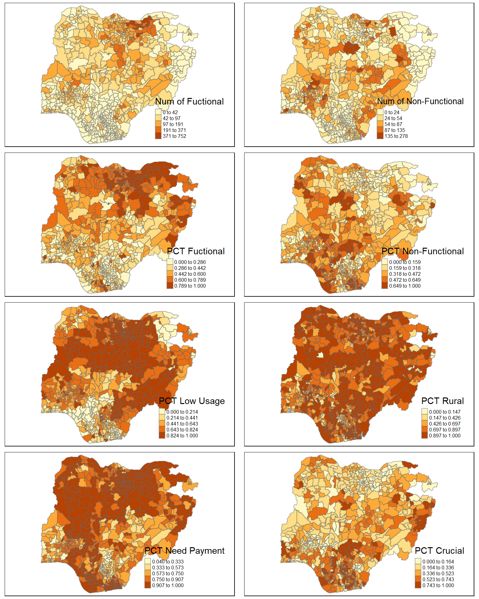
8 Hierarchical Cluster Analysis
In this section, we will perform hierarchical cluster analysis.
8.1 Extracting cluster variables
In the following code chunk, we are extracting the clustering variables from the nga_wp_filter simple feature object into a data.frame. We will exclude both the pct_lowusage and pct_highusage variables. We will also remove the geometry field by setting it to null (as we will not be able to exclude the geometry column by using select().
cluster_vars <- nga_wp %>%
  st_set_geometry(NULL) %>%
  select("shapeName", "wp_functional", "wp_nonfunctional", "pct_functional", "pct_nonfunctional", "pct_lowusage", "pct_rural", "pct_pay", "pct_crucial")
head(cluster_vars,5)
shapeName wp_functional wp_nonfunctional pct_functional pct_nonfunctional
1 Aba North 7 9 0.4117647 0.5294118
2 Aba South 29 35 0.4084507 0.4929577
4 Abaji 23 34 0.4035088 0.5964912
5 Abak 23 25 0.4791667 0.5208333
6 Abakaliki 82 42 0.3519313 0.1802575
pct_lowusage pct_rural pct_pay pct_crucial
1 0.17647059 0.00000000 0.9411765 0.4705882
2 0.12676056 0.05633803 0.8732394 0.3239437
4 0.40350877 0.84210526 0.6315789 0.5614035
5 0.08333333 0.83333333 0.9375000 0.7500000
6 0.90557940 0.87553648 0.5278970 0.1502146Next, we will use the LGA name as the row names instead of using the row number. In this way, we will preserve the LGA name in our dataframe and still, the LGA names will not be used as a clustering variable.
row.names(cluster_vars) <- cluster_vars$"shapeName"
head(cluster_vars,5)
shapeName wp_functional wp_nonfunctional pct_functional
Aba North Aba North 7 9 0.4117647
Aba South Aba South 29 35 0.4084507
Abaji Abaji 23 34 0.4035088
Abak Abak 23 25 0.4791667
Abakaliki Abakaliki 82 42 0.3519313
pct_nonfunctional pct_lowusage pct_rural pct_pay pct_crucial
Aba North 0.5294118 0.17647059 0.00000000 0.9411765 0.4705882
Aba South 0.4929577 0.12676056 0.05633803 0.8732394 0.3239437
Abaji 0.5964912 0.40350877 0.84210526 0.6315789 0.5614035
Abak 0.5208333 0.08333333 0.83333333 0.9375000 0.7500000
Abakaliki 0.1802575 0.90557940 0.87553648 0.5278970 0.1502146We can then delete the column for shapeName.
nga_wp_cluster <- select(cluster_vars, c(2:9))
head(nga_wp_cluster, 5)
wp_functional wp_nonfunctional pct_functional pct_nonfunctional
Aba North 7 9 0.4117647 0.5294118
Aba South 29 35 0.4084507 0.4929577
Abaji 23 34 0.4035088 0.5964912
Abak 23 25 0.4791667 0.5208333
Abakaliki 82 42 0.3519313 0.1802575
pct_lowusage pct_rural pct_pay pct_crucial
Aba North 0.17647059 0.00000000 0.9411765 0.4705882
Aba South 0.12676056 0.05633803 0.8732394 0.3239437
Abaji 0.40350877 0.84210526 0.6315789 0.5614035
Abak 0.08333333 0.83333333 0.9375000 0.7500000
Abakaliki 0.90557940 0.87553648 0.5278970 0.1502146Now that our data.frame only contains clustering variables as attributes, we can perform clustering using this data.frame.
8.2 Data standardisation
Next, we will evaluate the need for data standardisation. The purpose of the data standardisation is to avoid using variables with vastly different range of values as cluster analysis would be biased towards clustering variables with larger values.
In the following code chunk, we want to plot the range of values across all variables using boxplot.
ggplot(stack(nga_wp_cluster), aes(x=values, y=ind)) +
    geom_boxplot()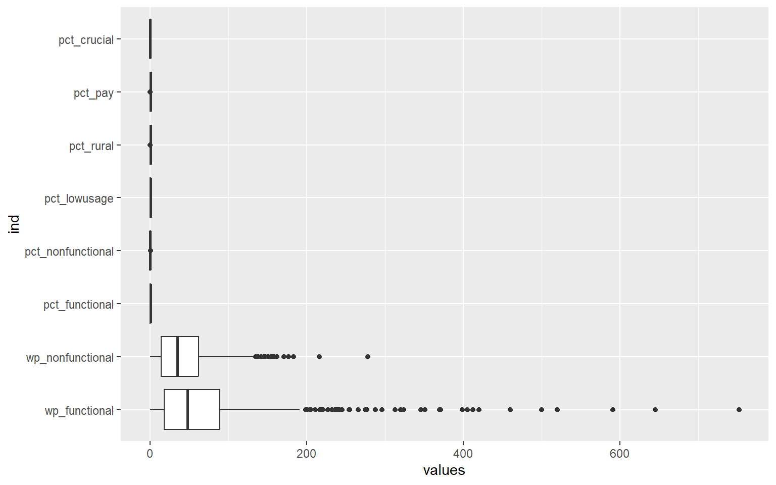
We can see that the range of the values across all variables differ quite significantly, as such, we will need to perform data standardisation.
There are 2 common approaches to perform data standardisation, namely min-max scaling and z-score standardisation. With Min-Max scaling, we scale the data values for each variable to a range of 0 to 1. With Z-score standardisation, we will scale each variable to have mean to be 0 and standard deviation to be 1. However, z-score standardisation assumes that all variables come from a normal distribution.
8.2.1 Visualising graphical distribution of variable values
We use the following code chunk to plot the distribution of the variable values to understand if the variables follow a normal distribution.
funct <- ggplot(data=nga_wp_cluster,
                  aes(x=`wp_functional`)) +
    geom_histogram(bins=20,
                   color="black",
                   fill="light blue")

nonfunct <- ggplot(data=nga_wp_cluster,
                  aes(x=`wp_nonfunctional`)) +
    geom_histogram(bins=20,
                   color="black",
                   fill="light blue")

pct_funct <- ggplot(data=nga_wp_cluster,
                  aes(x=`pct_functional`)) +
    geom_histogram(bins=20,
                   color="black",
                   fill="light blue")

pct_nonfunct <- ggplot(data=nga_wp_cluster,
                  aes(x=`pct_nonfunctional`)) +
    geom_histogram(bins=20,
                   color="black",
                   fill="light blue")

lowusage <- ggplot(data=nga_wp_cluster,
                  aes(x=`pct_lowusage`)) +
    geom_histogram(bins=20,
                   color="black",
                   fill="light blue")

rural <- ggplot(data=nga_wp_cluster,
                  aes(x=`pct_rural`)) +
    geom_histogram(bins=20,
                   color="black",
                   fill="light blue")

crucial <- ggplot(data=nga_wp_cluster,
                  aes(x=`pct_crucial`)) +
    geom_histogram(bins=20,
                   color="black",
                   fill="light blue")

pay <- ggplot(data=nga_wp_cluster,
                  aes(x=`pct_pay`)) +
    geom_histogram(bins=20,
                   color="black",
                   fill="light blue")

ggarrange(funct, nonfunct, pct_funct, pct_nonfunct, lowusage, rural, crucial,
          pay,
          ncol = 4,
          nrow = 2)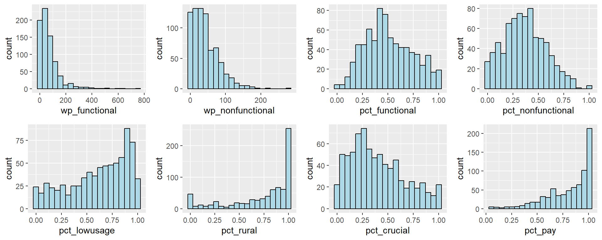
We observe that the distribution of most of the variables are skewed and do not follow a normal distribution. For instance, wp_functional has a right skew. As such, it is not suitable to use the Z-score normalisation.
8.2.2 Min-Max standardisation
In the code chunk below, we will standardise the clustering variables by using Min-Max method.
To perform this, we use normalize() from the heatmaply package. The summary() is then used to display the summary statistics of the standardised clustering variables.
nga_wp.std <- normalize(nga_wp_cluster)
summary(nga_wp.std)
wp_functional wp_nonfunctional pct_functional pct_nonfunctional
Min. :0.00000 Min. :0.00000 Min. :0.0000 Min. :0.0000
1st Qu.:0.02394 1st Qu.:0.05036 1st Qu.:0.3381 1st Qu.:0.2260
Median :0.06383 Median :0.12590 Median :0.4808 Median :0.3636
Mean :0.09207 Mean :0.15380 Mean :0.5123 Mean :0.3693
3rd Qu.:0.11835 3rd Qu.:0.22302 3rd Qu.:0.6780 3rd Qu.:0.5085
Max. :1.00000 Max. :1.00000 Max. :1.0000 Max. :1.0000
pct_lowusage pct_rural pct_pay pct_crucial
Min. :0.0000 Min. :0.0000 Min. :0.0000 Min. :0.0000
1st Qu.:0.4118 1st Qu.:0.6176 1st Qu.:0.6564 1st Qu.:0.1948
Median :0.6772 Median :0.8755 Median :0.8806 Median :0.3462
Mean :0.6162 Mean :0.7441 Mean :0.8018 Mean :0.3990
3rd Qu.:0.8718 3rd Qu.:1.0000 3rd Qu.:0.9910 3rd Qu.:0.5714
Max. :1.0000 Max. :1.0000 Max. :1.0000 Max. :1.0000 We can observe that the value range for each variable is now between 0 and 1 after min-max standardisation is performed.
In the following code chunk, we want to plot the boxplots of our standardised variables.
ggplot(stack(nga_wp.std), aes(x=values, y=ind)) +
    geom_boxplot()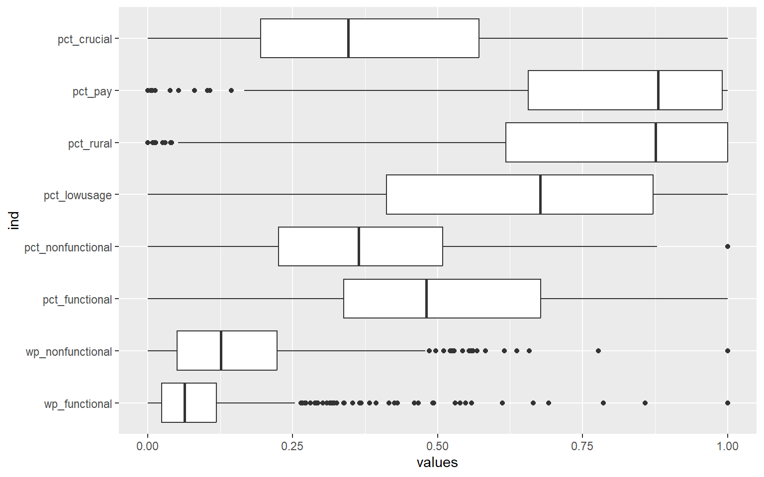
We can that the values of all the variables now have the same range of 0 to 1.
8.3 Computing the proximity matrix
In R, there are many packages that provide functions to calculate distance matrix. We will compute the proximity matrix by using dist() of R.
dist() supports six distance proximity calculations: euclidean, maximum, manhattan, canberra, binary and minkowski. The default is the euclidean proximity matrix.
The code chunk below is used to compute the proximity matrix using the euclidean method.
proxmat <- dist(nga_wp.std, method = 'euclidean')8.4 Computing the hierarchical clustering and selecting the optimal clustering algorithm
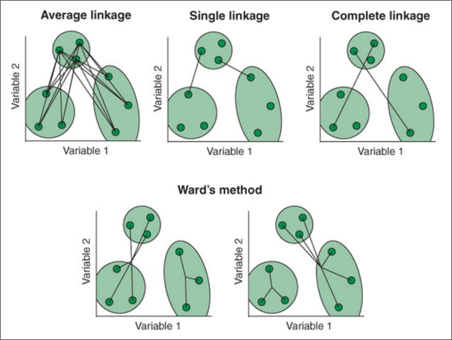
There are several ways to compute hierarchical clustering. This is because of the different linkage methods available to calculate the distance between clusters. The following provides explanations of 4 of the methods:
Average: Average linkage calculates all pairwise distances between cases in two clusters and finds the mean.
Single: Single linkage calculates the smallest distance between clusters.
Complete: Complete linkage calculates the largest distance between clusters.
Ward: Ward’s method calculates the within-cluster sum of squares for each candidate merge and chooses the one with the smallest value.
The calculation involved in each algorithm is illustrated in the following diagram. [3]
We will use agnes() function from cluster package to perform hierarchical clustering. The advantage of using agnes() function is that we are able to get the agglomerative coefficient of the clusters obtained from each linkage calculation as described above. The agglomerative coefficient measures the amount of clustering structure found. The closer the coefficient is to 1, the stronger the clustering structure.
In the following code chunk, we will compute the agglomerative coefficient of the 4 hierarchical clustering algorithms: average, single, complete, and ward.
m <- c( "average", "single", "complete", "ward")
names(m) <- c( "average", "single", "complete", "ward")

ac <- function(x) {
  agnes(nga_wp.std, method = x)$ac
}

map_dbl(m, ac)
average single complete ward
0.8524337 0.7438841 0.9172081 0.9818351 We can see that Ward’s method provides the strongest clustering structure among the four algorithms assessed. Hence, in the subsequent analysis, only Ward’s method will be used.
8.5 Determining the optimal number of clusters
We will determine the optimal number of clusters using a gap statistic.
8.5.1 Gap statistic method
The gap statistic compares the total intra-cluster variation for different values of k with their expected values under null reference distribution of the data. The estimate of the optimal clusters will be the value that maximizes the gap statistic (i.e., that yields the largest gap statistic). This means that the clustering structure is furthest away from the random uniform distribution of points.
To compute the gap statistic, clusGap() of cluster package will be used. We will set seed 12345 to make the results reproducible as the calculations involve bootstrapping via Monte Carlo simulations. In the following code chunk, we have specified the number of Monte Carlo samples to be 50 (argument B).
set.seed(12345)
gap_stat <- clusGap(nga_wp.std,
                    FUN = hcut,
                    nstart = 25,
                    K.max = 10,
                    B = 50)
# Print the result
print(gap_stat, method = "firstmax")
Clustering Gap statistic ["clusGap"] from call:
clusGap(x = nga_wp.std, FUNcluster = hcut, K.max = 10, B = 50, nstart = 25)
B=50 simulated reference sets, k = 1..10; spaceH0="scaledPCA"
--> Number of clusters (method 'firstmax'): 10
logW E.logW gap SE.sim
[1,] 5.091646 5.656593 0.5649472 0.006537434
[2,] 4.980636 5.556008 0.5753712 0.009257900
[3,] 4.882804 5.504556 0.6217523 0.009569719
[4,] 4.803709 5.460590 0.6568811 0.009639142
[5,] 4.726012 5.423250 0.6972383 0.009330416
[6,] 4.676814 5.390737 0.7139238 0.009701430
[7,] 4.644868 5.362836 0.7179680 0.009421233
[8,] 4.618385 5.337163 0.7187785 0.008867952
[9,] 4.589876 5.313976 0.7241001 0.008323950
[10,] 4.562514 5.293071 0.7305569 0.008225253Next, we can visualise the plot by using fviz_gap_stat() of factoextra package.
fviz_gap_stat(gap_stat)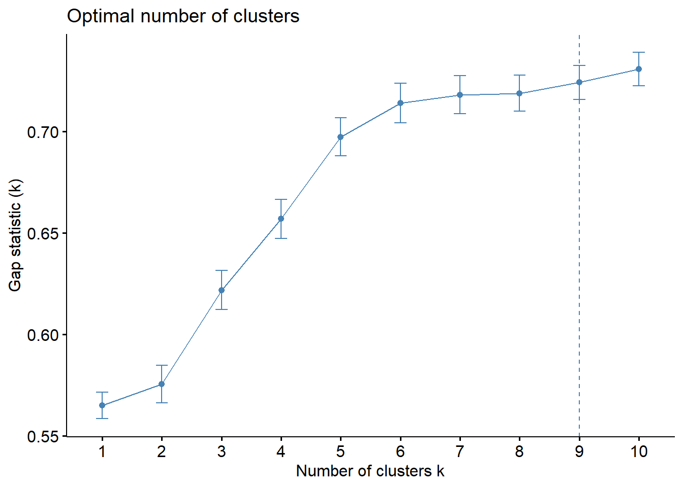
The results above reflect that the optimal number of clusters is 9.
8.6 Visually-driven hierarchical clustering analysis
We can visualise the hierarchical clusters as a heatmap of the variables by using the heatmaply package. We will plot an interactive cluster heatmap for our visualisation.
We will first have to convert our data (which is in a data frame) into a data matrix to plot the heatmap. The code chunk below transforms the nga_wp.std data frame into a data matrix.
nga_wp_mat <- data.matrix(nga_wp.std)In the code chunk below, the heatmaply() of heatmaply package is used to build an interactive cluster heatmap.
heatmaply(normalize(nga_wp_mat),
          Colv=NA,
          dist_method = "euclidean",
          hclust_method = "ward.D",
          seriate = "OLO",
          colors = Blues,
          k_row = 9,
          margins = c(NA,200,60,NA),
          fontsize_row = 2,
          fontsize_col = 5,
          main="Geographic Segmentation of LGA by water point indicators",
          xlab = "Water point indicators",
          ylab = "LGA Names"
          )
We noticed several characteristics of the clusters (on going down the dendrogram):
| Cluster | Color on dendrogram | Summary of key characteristics |
|---|---|---|
| 1 | Dark Pink |
|
| 2 | Purple |
|
| 3 | Blue |
|
| 4 | Dark green |
|
| 5 | Green |
|
| 6 | Light green |
|
| 7 | Yellow |
|
| 8 | Orange |
|
| 9 | Pink |
|
From the analysis above, there is a distinction between each of the clusters. Hence, we will keep the clusters as 9.
8.7 Mapping the clusters formed
In this section, we will map the clusters formed. We will use cutree() of R Base to derive a 9-cluster model in the following code chunk.
hclust_ward <- hclust(proxmat, method = 'ward.D')
groups <- as.factor(cutree(hclust_ward, k=9))
The output groups is a list object containing the cluster ID for each LGA.
To visualise the clusters, the group object needs to be appended onto the nga_wp simple feature object. This is performed using the code chunk below, in three steps as explained in the following:
- as.matrix() transforms the
groupslist into a matrix; - cbind() appends the
groupsmatrix ontonga_wpsimple features to produce an output that is a simple feature; - rename() is used to rename
as.matrix.groups.field to H_CLUSTER
nga_wp <- cbind(nga_wp, as.matrix(groups)) nga_wp <- nga_wp%>%
rename(`H_CLUSTER`=`as.matrix.groups.`)We will then use qtm() from tmap package to plot the choropleth map to show the clusters.
qtm(nga_wp, "H_CLUSTER")+
    tm_layout(main.title = "Hierarchical Clustering",
              main.title.size = 1.2,
              main.title.fontface = "bold",
              legend.width = 0.4,
              legend.height = 0.3)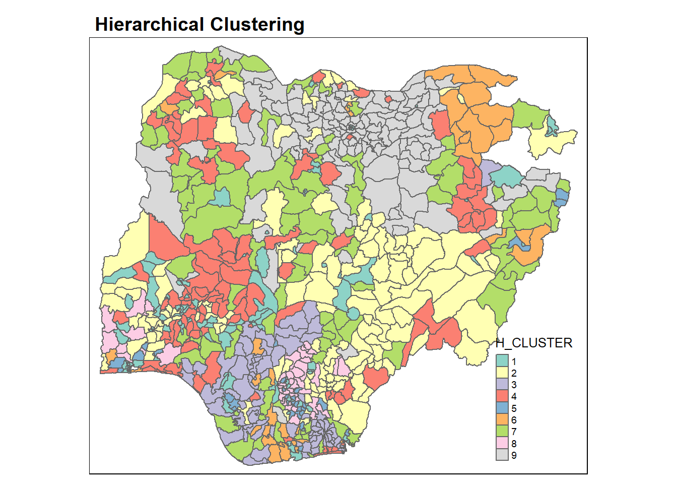
The choropleth map above reveals that the clusters are very fragmented. This is a major limitation when non-spatial clustering algorithm such as hierarchical cluster analysis is used for regionalisation.
We can also get the summary for each cluster by the mean of each clustering variables as shown in the following code chunk:
nga_wp %>%
    st_set_geometry(NULL) %>%
    group_by(H_CLUSTER) %>%
    summarise_at(c(7,8,16,17,19,21:23), mean)
# A tibble: 9 × 9
H_CLUSTER wp_functio…¹ wp_no…² pct_f…³ pct_n…⁴ pct_l…⁵ pct_r…⁶ pct_pay pct_c…⁷
<chr> <dbl> <dbl> <dbl> <dbl> <dbl> <dbl> <dbl> <dbl>
1 1 57.5 37.6 0.566 0.324 0.497 0.168 0.788 0.174
2 2 70.6 51.9 0.433 0.335 0.744 0.872 0.646 0.381
3 3 15.1 28.4 0.332 0.651 0.146 0.907 0.902 0.715
4 4 88.7 82.9 0.478 0.476 0.626 0.849 0.905 0.226
5 5 14.7 23.4 0.257 0.483 0.340 0.392 0.670 0.748
6 6 29.1 5.94 0.833 0.140 0.202 0.710 0.909 0.467
7 7 38.6 50.8 0.443 0.527 0.751 0.933 0.931 0.554
8 8 13.3 11.0 0.203 0.172 0.712 0.707 0.288 0.789
9 9 160. 33.0 0.812 0.185 0.874 0.905 0.969 0.224
# … with abbreviated variable names ¹wp_functional, ²wp_nonfunctional,
# ³pct_functional, ⁴pct_nonfunctional, ⁵pct_lowusage, ⁶pct_rural,
# ⁷pct_crucial9 Spatially Constrained Clustering: SKATER Approach
In this section, we will derive spatially constrained clusters by using skater() method from spdep package.
9.1 Converting data into SpatialPolygonsDataFrame
We will first need to convert nga_wp into a SpatialPolygonsDataFrame. This is because the SKATER function only supports sp objects such as the SpatialPolygonsDataFrame. We will perform this using as_Spatial() from sf package.
nga_sp <- as_Spatial(nga_wp)9.2 Computing neighbour list
Next, we will use poly2nb() from spdep package to compute the neighbours list object from the polygon list.
nga.nb <- poly2nb(nga_sp)
summary(nga.nb)
Neighbour list object:
Number of regions: 753
Number of nonzero links: 4306
Percentage nonzero weights: 0.7594236
Average number of links: 5.718459
Link number distribution:
1 2 3 4 5 6 7 8 9 10 11 12 14
2 19 54 121 175 136 122 68 39 11 4 1 1
2 least connected regions:
138 560 with 1 link
1 most connected region:
508 with 14 linksWe can draw a graph representation of the neighbour structure. In the following code, we will plot the area boundaries first. This is followed by the plot of the neighbour list object. We also set the colour to blue and specify add=TRUE to plot the network on top of the boundaries.
plot(nga_sp,
border=grey(.5))
plot(nga.nb,
coordinates(nga_sp),
col="blue",
add=TRUE)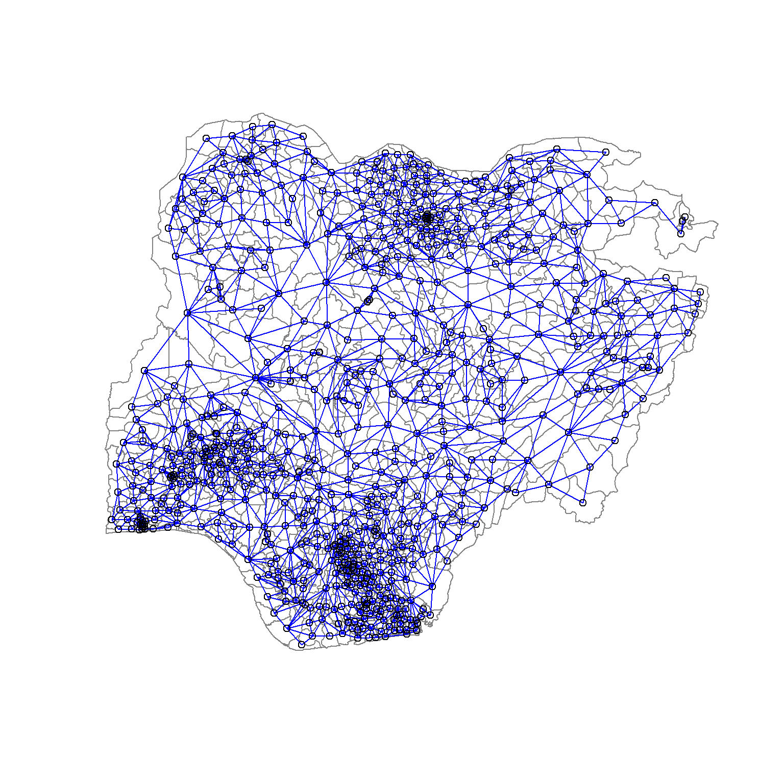
9.3 Computing minimum spanning tree
The SKATER algorithm uses a minimum spanning tree (MST) for the records in its calculation. The MST is a graph that includes all nodes in the network but only passes each node once. This way, the complexity of the graph is minimised since each node is connected to only one other node. The resulting tree has n nodes and n-1 edges. The objective of the calculation is to minimise the overall length (or cost) of the tree. This cost can be regarded as the distances between the nodes.
9.3.1 Calculating edge costs
We will first need to compute the edge cost associated with each edge in the neighbour list. This cost refers to the dissimilarity between each pair of neighbours (as defined by the neighbours list). The following code chunk is used to compute the cost of each edge.
lcosts <- nbcosts(nga.nb, nga_wp.std)
head(lcosts)[[1]]
[1] 0.2076065 1.1530899 0.8947909 1.2052173
[[2]]
[1] 0.2076065 0.8921187 1.2167456
[[3]]
[1] 0.6560673 0.4979778 0.3962916 0.2315877 0.4816761 0.8372297 0.3884884
[[4]]
[1] 0.2442841 0.2488396 0.2128474 0.5014532 0.2767833
[[5]]
[1] 0.3687666 0.2284805 0.2303748 0.2652510 0.5847221 0.5444482 0.4443433
[[6]]
[1] 0.4345994 0.9122569 1.0792675 0.6983658 1.3413376 0.9867793For each LGA, this gives the pairwise dissimilarity between its values on the eight clustering variables and its neighbour’s corresponding values. Basically, this is the notion of a generalised weight for a spatial weights matrix.
Next, we will convert the neighbour list to a list weights object by using the computed lcosts as the weights. To do this, we use nb2listw() of spdep package as shown in the code chunk below. We need to specify the style as B to make sure the cost values are not row-standardised.
nga.w <- nb2listw(nga.nb,
lcosts,
style="B")
summary(nga.w)Characteristics of weights list object:
Neighbour list object:
Number of regions: 753
Number of nonzero links: 4306
Percentage nonzero weights: 0.7594236
Average number of links: 5.718459
Link number distribution:

  1   2   3   4   5   6   7   8   9  10  11  12  14
  2  19  54 121 175 136 122  68  39  11   4   1   1
2 least connected regions:
138 560 with 1 link
1 most connected region:
508 with 14 links
Weights style: B
Weights constants summary:
n nn S0 S1 S2
B 753 567009 2429.924 3412.771 37813.49.3.2 Computing minimum spanning tree
The minimium spanning tree is computed by mean of the mstree() from spdep package as shown in the code chunk below. The result is a special type of matrix and it summarises the tree by giving each edge as the pair of connected nodes and the cost associated with that edge.
nga.mst <- mstree(nga.w)After computing the MST, we can check its class and dimension by using the code chunk below.
class(nga.mst)[1] "mst" "matrix"dim(nga.mst)[1] 752 3We can see that the dimension is 752 instead of 753 (i.e. the total number of LGAs considered for clustering). This is because the minimum spanning tree consists of n-1 edges that traverses all the nodes.
We can display the content using head() as shown in the following code chunk.
head(nga.mst) [,1] [,2] [,3]
[1,] 120 294 0.2397947
[2,] 120 572 0.2555644
[3,] 572 604 0.3290324
[4,] 604 166 0.3269686
[5,] 572 591 0.3336202
[6,] 572 345 0.37908819.4 Computing spatially constrained clusters using SKATER method
The skater() function takes three mandatory arguments: the first two columns of the MST matrix (i.e. not the costs), the standardized data matrix (to update the costs as units are being grouped), and the number of cuts. The value specified for the number of cuts is not the number of clusters, but instead, the number of cuts in the graph, i.e. one less than the number of clusters.
clust9 <- spdep::skater(edges = nga.mst[,1:2],
                 data = nga_wp.std,
                 method = "euclidean",
                 ncuts = 8)
The result of the skater() is an object of class skater. We can examine its contents by using the code chunk below.
str(clust9)List of 8
$ groups : num [1:753] 2 2 1 2 4 5 5 4 2 2 ...
$ edges.groups:List of 9
..$ :List of 3
.. ..$ node: num [1:181] 644 89 119 23 506 460 474 214 247 631 ...
.. ..$ edge: num [1:180, 1:3] 623 490 233 732 179 619 344 735 572 214 ...
.. ..$ ssw : num 84.6
..$ :List of 3
.. ..$ node: num [1:198] 568 605 60 575 59 153 540 297 205 354 ...
.. ..$ edge: num [1:197, 1:3] 297 59 575 540 60 354 505 153 530 184 ...
.. ..$ ssw : num 110
..$ :List of 3
.. ..$ node: num [1:173] 487 405 374 658 256 225 509 107 160 458 ...
.. ..$ edge: num [1:172, 1:3] 458 464 746 434 668 710 151 128 254 372 ...
.. ..$ ssw : num 78.7
..$ :List of 3
.. ..$ node: num [1:16] 512 351 556 211 580 13 555 525 17 5 ...
.. ..$ edge: num [1:15, 1:3] 556 556 555 164 525 580 351 211 17 5 ...
.. ..$ ssw : num 5.3
..$ :List of 3
.. ..$ node: num [1:55] 559 14 80 341 170 208 523 577 630 305 ...
.. ..$ edge: num [1:54, 1:3] 577 305 577 630 306 265 537 305 523 170 ...
.. ..$ ssw : num 26.5
..$ :List of 3
.. ..$ node: num [1:47] 744 61 453 403 396 450 86 621 738 471 ...
.. ..$ edge: num [1:46, 1:3] 403 450 396 86 738 441 441 621 471 381 ...
.. ..$ ssw : num 16.6
..$ :List of 3
.. ..$ node: num [1:42] 55 75 707 598 22 280 516 183 281 209 ...
.. ..$ edge: num [1:41, 1:3] 22 516 280 183 558 707 598 298 281 280 ...
.. ..$ ssw : num 22.2
..$ :List of 3
.. ..$ node: num [1:27] 480 154 483 666 493 655 67 241 136 237 ...
.. ..$ edge: num [1:26, 1:3] 483 493 67 655 136 237 237 67 237 96 ...
.. ..$ ssw : num 15.3
..$ :List of 3
.. ..$ node: num [1:14] 50 602 48 286 672 201 315 21 496 447 ...
.. ..$ edge: num [1:13, 1:3] 50 201 672 286 672 602 315 50 315 602 ...
.. ..$ ssw : num 4.83
$ not.prune : NULL
$ candidates : int [1:9] 1 2 3 4 5 6 7 8 9
$ ssto : num 463
$ ssw : num [1:9] 463 432 415 400 390 ...
$ crit : num [1:2] 1 Inf
$ vec.crit : num [1:753] 1 1 1 1 1 1 1 1 1 1 ...
- attr(*, "class")= chr "skater"The most interesting component of this list structure is the groups vector that contains the labels of the cluster to which each observation belongs . This is followed by a detailed summary for each of the clusters in the edges.groups list. Sum of squares measures are given as ssto for the total and ssw to show the effect of each of the cuts on the overall criterion.
We can check the cluster assignment using the following.
ccs9 <- clust9$groups
ccs9
[1] 2 2 1 2 4 5 5 4 2 2 1 1 4 5 1 5 4 2 1 1 9 7 1 2 2 2 1 1 1 1 9 3 2 5 6 2 1
[38] 1 2 1 2 2 1 1 1 3 1 9 3 9 7 7 7 2 7 2 2 3 2 2 6 1 1 2 1 2 8 1 1 5 5 1 3 6
[75] 7 7 7 7 3 5 3 1 3 3 3 6 6 6 1 1 6 3 3 3 3 8 3 2 2 2 3 1 6 3 1 3 3 3 1 3 8
[112] 1 3 2 6 1 2 2 1 1 1 2 3 3 3 3 1 3 2 2 1 2 2 1 3 8 3 3 3 6 3 3 1 3 1 3 6 3
[149] 3 3 3 2 2 8 3 1 6 6 7 3 3 3 2 4 1 1 1 1 1 5 5 5 1 2 2 1 2 2 1 1 1 1 7 2 2
[186] 1 7 7 7 5 2 2 2 2 2 2 2 2 2 2 9 2 2 2 2 2 2 5 7 2 4 4 3 1 3 3 8 6 3 3 3 1
[223] 3 3 3 8 3 3 3 6 6 3 1 2 3 3 8 3 2 6 8 1 1 3 2 3 1 1 3 3 8 1 1 3 1 3 3 2 2
[260] 3 3 8 8 5 5 5 5 5 2 5 5 5 5 2 2 6 2 2 1 7 7 7 7 5 1 9 1 1 1 1 1 1 1 1 5 3
[297] 2 7 7 7 2 7 2 5 5 5 5 1 1 2 2 2 3 2 9 5 1 1 2 2 5 2 2 2 2 4 2 1 2 1 1 1 1
[334] 1 1 1 1 5 3 2 5 2 5 1 1 1 5 3 1 5 4 2 2 2 2 1 2 5 2 2 2 3 5 2 2 5 5 4 1 8
[371] 3 3 6 3 1 1 3 3 6 6 6 1 3 1 3 3 3 3 1 1 3 5 3 1 6 6 3 6 3 3 3 3 6 1 3 1 3
[408] 2 3 1 3 1 3 2 1 1 2 3 3 3 3 3 1 1 1 2 3 2 1 9 3 3 1 3 3 3 3 6 3 1 6 2 1 8
[445] 1 5 9 9 8 6 6 1 6 1 3 2 1 3 3 1 3 3 3 3 8 1 3 1 3 3 6 3 3 1 3 3 1 3 3 8 2
[482] 2 8 3 6 3 3 2 1 1 1 1 8 8 3 9 1 6 3 3 1 1 2 2 2 1 2 3 3 7 7 4 7 7 7 7 2 2
[519] 2 7 8 2 5 2 4 2 2 2 1 2 2 2 2 5 2 1 5 2 1 2 2 2 2 2 1 1 1 2 2 2 5 2 2 2 4
[556] 4 2 7 5 4 1 1 1 2 2 2 2 2 2 1 2 1 5 5 2 2 5 1 1 4 7 2 2 2 2 5 2 1 1 7 1 2
[593] 7 2 2 2 7 7 2 2 2 9 2 1 2 2 2 2 2 2 2 2 1 1 7 2 5 5 1 1 6 2 1 2 3 6 3 1 3
[630] 5 1 3 3 3 6 3 3 3 1 3 3 2 1 1 5 3 1 2 6 5 1 1 8 3 8 6 3 3 1 6 9 1 3 1 1 8
[667] 2 3 1 3 1 9 1 1 3 2 3 6 3 1 1 3 2 3 3 3 3 1 8 3 3 3 1 7 7 2 2 2 2 2 2 2 2
[704] 2 2 2 7 2 2 3 7 2 2 2 6 2 2 7 2 1 1 3 3 2 2 2 1 6 3 6 1 1 1 1 1 2 2 6 3 1
[741] 2 8 8 6 3 3 3 3 3 3 6 3 1We can also found out the number of LGAs in each cluster by means of the table() command.
table(ccs9)ccs9
1 2 3 4 5 6 7 8 9
181 198 173 16 55 47 42 27 14 9.5 Visualising the clusters on a choropleth map
Finally, we can illustrate the clustering on the map.
groups_mat <- as.matrix(clust9$groups)
nga_wp <- cbind(nga_wp, as.factor(groups_mat)) %>%
  rename(`Skater_CLUSTER`=`as.factor.groups_mat.`)
qtm(nga_wp, "Skater_CLUSTER")+
    tm_layout(main.title = "SKATER Spatially Constrained Hierarchical Clustering",
              main.title.size = 1,
              main.title.fontface = "bold",
              legend.width = 0.4,
              legend.height = 0.3)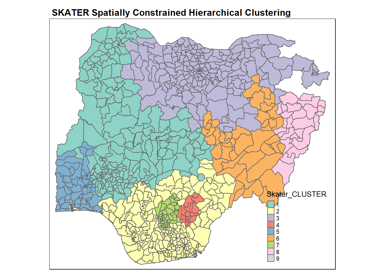
Likewise, we can get a summary of the water point attributes for each cluster using the following code chunk.
nga_wp %>%
    st_set_geometry(NULL) %>%
    group_by(Skater_CLUSTER) %>%
    summarise_at(c(7,8,16,17,19,21:23), mean)
# A tibble: 9 × 9
Skater_CLUSTER wp_fu…¹ wp_no…² pct_f…³ pct_n…⁴ pct_l…⁵ pct_r…⁶ pct_pay pct_c…⁷
<fct> <dbl> <dbl> <dbl> <dbl> <dbl> <dbl> <dbl> <dbl>
1 1 69.0 60.2 0.506 0.438 0.650 0.736 0.877 0.275
2 2 25.2 34.3 0.381 0.503 0.377 0.797 0.830 0.585
3 3 144. 41.8 0.757 0.237 0.806 0.821 0.931 0.254
4 4 102. 55.1 0.407 0.222 0.914 0.940 0.602 0.254
5 5 44.4 36.7 0.396 0.310 0.524 0.534 0.631 0.379
6 6 88.8 79.4 0.415 0.400 0.844 0.866 0.689 0.380
7 7 11.2 9.52 0.270 0.220 0.649 0.528 0.374 0.690
8 8 16.5 4.33 0.716 0.284 0.651 0.730 0.894 0.607
9 9 37.5 9.93 0.665 0.135 0.315 0.0147 0.634 0.198
# … with abbreviated variable names ¹wp_functional, ²wp_nonfunctional,
# ³pct_functional, ⁴pct_nonfunctional, ⁵pct_lowusage, ⁶pct_rural,
# ⁷pct_crucialFor easier comparison, we will plot both the hierarchical clustering and spatially constrained hierarchical clustering maps next to each other using the code chunk below.
hclust.map <- qtm(nga_wp,
                  "H_CLUSTER") +
  tm_borders(alpha = 0.5) +
    tm_layout(main.title = "Hierarchical Clustering",
              main.title.size = 0.6,
              main.title.fontface = "bold",
              legend.width = 0.4,
              legend.height = 0.3)

skclust.map <- qtm(nga_wp,
                   "Skater_CLUSTER") +
  tm_borders(alpha = 0.5)+
    tm_layout(main.title = "SKATER Spatially Constrained Hierarchical Clustering",
              main.title.size = 0.6,
              main.title.fontface = "bold",
              legend.width = 0.4,
              legend.height = 0.3)

tmap_arrange(hclust.map, skclust.map,
             asp=NA, ncol=2)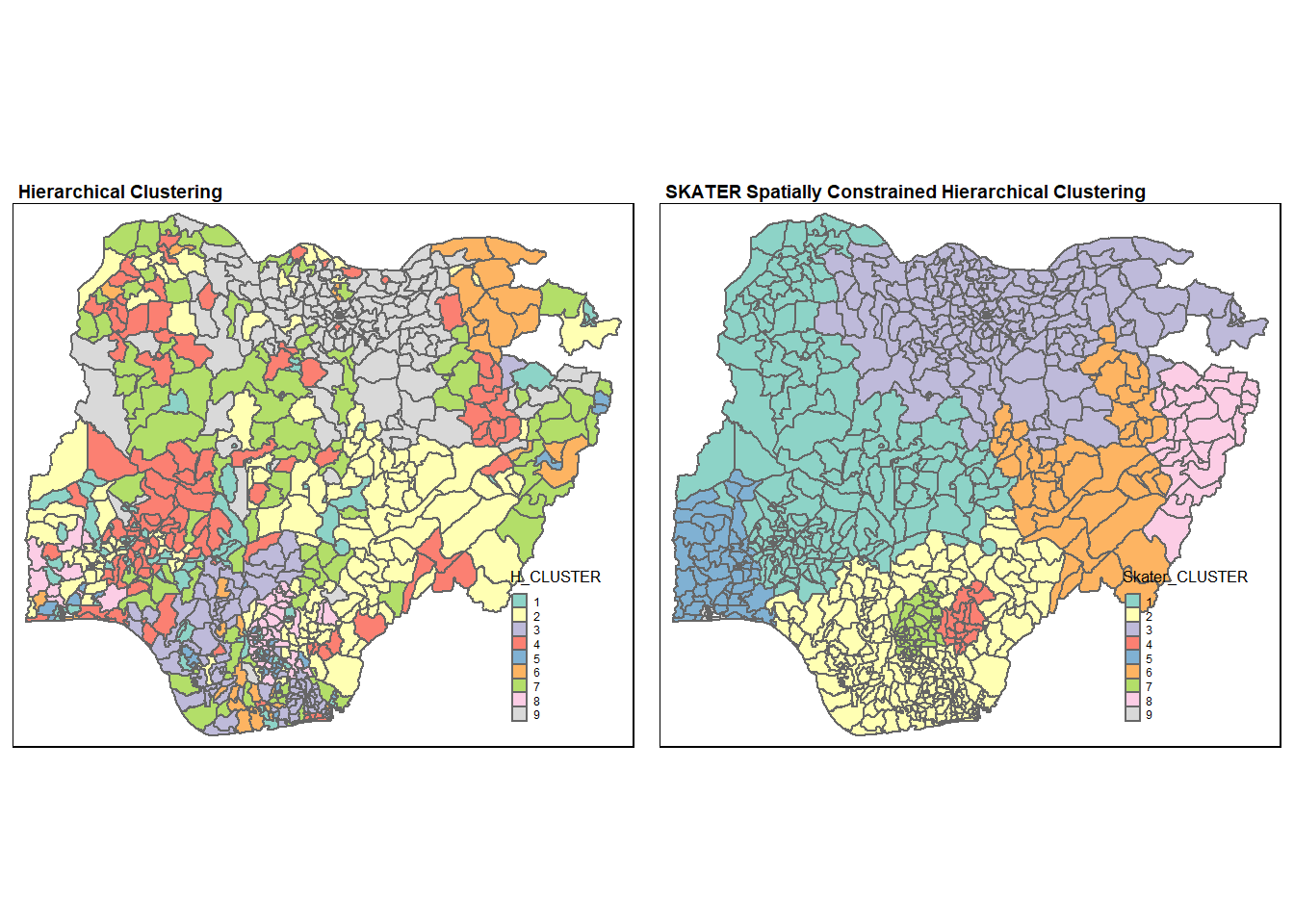
As expected, the clusters formed from spatially constrained clustering is much more geographically cohesive compared to those formed from hierarchical clustering.
10 Spatially Constrained Clustering using ClustGeo
ClustGeo package implements a Ward-like hierarchical clustering algorithm that includes spatial/geographical constraints. The algorithm takes in two dissimilarity matrices D0 and D1, along with a mixing parameter alpha in that ranges from 0 to 1 (both inclusive). The dissimilarities can be non-Euclidean and the weights of the observations can be non-uniform. The first matrix gives the dissimilarities in the variable space and the second matrix gives the dissimilarities in the spatial space. The idea is to determine a value of alpha which increases the spatial contiguity without deteriorating too much on the quality of the solution calculated based on the variables.
10.1 Ward-like hierarchical clustering: ClustGeo
The ClustGeo package provides the function called hclustgeo() to perform a typical Ward-like hierarchical clustering just like hclust() that was used in section 8.8.
To perform non-spatially constrained hierarchical clustering, we only need to provide the dissimilarity matrix as shown in the following code chunk. The dissimilarity matrix provided here must be an object of class dist, i.e. an object that is obtained using dist().
nongeo_cluster <- hclustgeo(proxmat)10.1.1 Mapping the clusters formed
Similarly, we can visualise the clusters on the map.
groups <- as.factor(cutree(nongeo_cluster, k=9))nga_wp <- cbind(nga_wp, as.matrix(groups)) %>%
rename(`ClustG_HCLUSTER` = `as.matrix.groups.`)qtm(nga_wp, "ClustG_HCLUSTER")+
tm_layout(main.title = "ClustGeo Hierarchical Clustering",
main.title.size = 1.1,
main.title.fontface = "bold",
legend.width = 0.4,
legend.height = 0.3)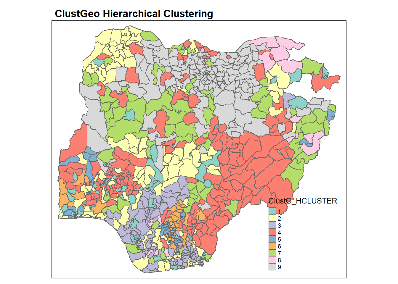
Again, the choropleth map above reveals that the clusters formed by using hierarchical analysis are very fragmented spatially.
In the following code chunk, we get the summary of attribute means for each cluster.
nga_wp %>%
    st_set_geometry(NULL) %>%
    group_by(ClustG_HCLUSTER) %>%
    summarise_at(c(7,8,16,17,19,21:23), mean)
# A tibble: 9 × 9
ClustG_HCLUS…¹ wp_fu…² wp_no…³ pct_f…⁴ pct_n…⁵ pct_l…⁶ pct_r…⁷ pct_pay pct_c…⁸
<chr> <dbl> <dbl> <dbl> <dbl> <dbl> <dbl> <dbl> <dbl>
1 1 56.4 33.8 0.606 0.316 0.445 0.169 0.830 0.153
2 2 47.3 48.1 0.472 0.482 0.460 0.919 0.870 0.373
3 3 14.8 27.8 0.334 0.650 0.144 0.895 0.905 0.722
4 4 89.8 74.6 0.430 0.371 0.793 0.844 0.710 0.314
5 5 18.8 21.2 0.275 0.357 0.510 0.328 0.541 0.652
6 6 14.5 11.6 0.222 0.187 0.680 0.807 0.308 0.775
7 7 40.2 47.7 0.475 0.494 0.829 0.920 0.930 0.579
8 8 25.5 2.74 0.927 0.0700 0.249 0.846 0.965 0.535
9 9 161. 34.6 0.807 0.191 0.879 0.888 0.971 0.215
# … with abbreviated variable names ¹ClustG_HCLUSTER, ²wp_functional,
# ³wp_nonfunctional, ⁴pct_functional, ⁵pct_nonfunctional, ⁶pct_lowusage,
# ⁷pct_rural, ⁸pct_crucial10.2 Spatially Constrained (by Distance) Hierarchical Clustering
Next, we will perform clustering with spatial constraints. We will first need to compute a spatial matrix by using st_distance() from sf package. The function as.dist() is used to convert the data frame into a matrix.
dist <- st_distance(nga_wp, nga_wp)
distmat <- as.dist(dist)
Next, choicealpha() will be used to determine a suitable value for the mixing parameter alpha as shown in the code chunk below.
cr <- choicealpha(proxmat, distmat, range.alpha = seq(0, 1, 0.1), K=9, graph = TRUE)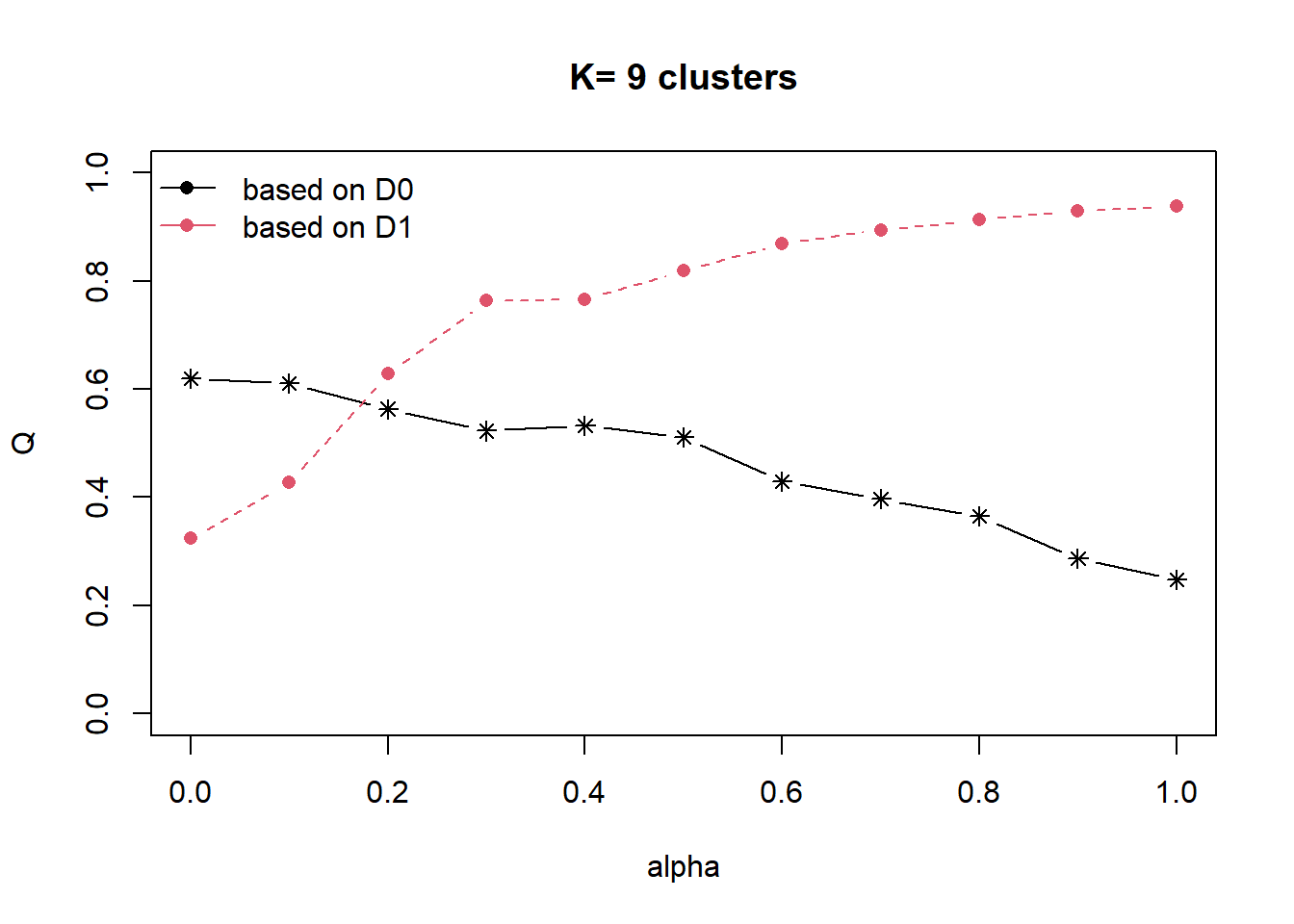
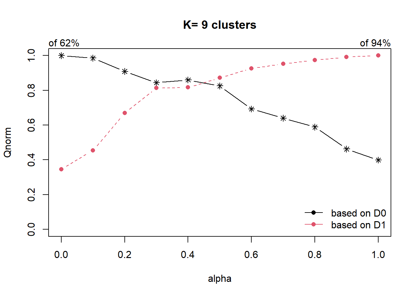
The parameter alpha in [0,1] sets the importance of D0 and D1 in the clustering process. When alpha=0, the geographical dissimilarities are not taken into account and when alpha=1 the distances between water point attributes are not taken into account and the clusters are obtained with the geographical distances only.
We can also derive the exact proportion of explained inertia using the code chunk below. The homogeneity Q0 is the proportion of explained inertia calculated with D0 (likewise Q1 for D1).
cr$Q Q0 Q1
alpha=0 0.6197622 0.3242964
alpha=0.1 0.6109510 0.4270533
alpha=0.2 0.5633979 0.6280446
alpha=0.3 0.5229639 0.7638126
alpha=0.4 0.5328042 0.7663211
alpha=0.5 0.5116800 0.8185793
alpha=0.6 0.4292704 0.8690167
alpha=0.7 0.3967863 0.8945010
alpha=0.8 0.3648866 0.9140518
alpha=0.9 0.2866144 0.9302453
alpha=1 0.2474455 0.9383978The plot and results show that the proportion of explained inertia with D0 (the water point attributes) is equal to 0.62 when alpha=0 and decreases when alpha increases (black line). On the other hand, the proportion of explained inertia calculated with D1 (the spatial distances) is equal to 0.94 when alpha=1 and decreases when alpha decreases (red line).
Here, the results suggest to use alpha=0.2 which corresponds to a lost of water point attributes homogeneity by 6% and a significant gain in spatial homogeneity by 30%.
We will use alpha=0.2 in the following code chunk.
clustG <- hclustgeo(proxmat, distmat, alpha = 0.2)Next, we will use cutree() to derive the cluster object.
groups <- as.factor(cutree(clustG, k=9))We will then join back the group list with nga_wp polygon feature data frame by using the code chunk below.
nga_wp <- cbind(nga_wp, as.matrix(groups)) %>%
  rename(`ClustG_SPCLUSTER` = `as.matrix.groups.`)
We can now plot the map of the newly delineated spatially constrained clusters.
qtm(nga_wp, "ClustG_SPCLUSTER")+
    tm_layout(main.title = "ClustGeo Spatially Constrained (by distance) Hierarchical Clustering",
              main.title.size = 0.6,
              main.title.fontface = "bold",
              legend.width = 0.4,
              legend.height = 0.3)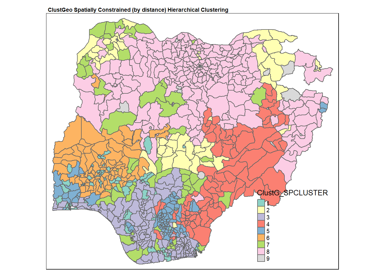
In the following code chunk, we get the summary of attribute means for each cluster.
nga_wp %>%
    st_set_geometry(NULL) %>%
    group_by(ClustG_SPCLUSTER) %>%
    summarise_at(c(7,8,16,17,19,21:23), mean)
# A tibble: 9 × 9
ClustG_SPCLU…¹ wp_fu…² wp_no…³ pct_f…⁴ pct_n…⁵ pct_l…⁶ pct_r…⁷ pct_pay pct_c…⁸
<chr> <dbl> <dbl> <dbl> <dbl> <dbl> <dbl> <dbl> <dbl>
1 1 49.6 36.5 0.565 0.343 0.410 0.182 0.815 0.167
2 2 55.3 35.3 0.627 0.343 0.368 0.807 0.799 0.417
3 3 21.4 30.0 0.408 0.554 0.193 0.889 0.897 0.600
4 4 81.5 73.3 0.374 0.370 0.832 0.911 0.665 0.383
5 5 12.9 13.0 0.242 0.274 0.574 0.556 0.431 0.748
6 6 76.0 66.8 0.448 0.391 0.696 0.771 0.794 0.252
7 7 27.4 59.9 0.311 0.644 0.701 0.955 0.928 0.592
8 8 131. 39.4 0.744 0.251 0.856 0.894 0.936 0.289
9 9 82.2 38.8 0.706 0.275 0.617 0.110 0.914 0.0879
# … with abbreviated variable names ¹ClustG_SPCLUSTER, ²wp_functional,
# ³wp_nonfunctional, ⁴pct_functional, ⁵pct_nonfunctional, ⁶pct_lowusage,
# ⁷pct_rural, ⁸pct_crucialAgain, for easier comparison, we will plot both the hierarchical clustering and spatially constrained hierarchical clustering maps next to each other using the code chunk below.
Hclust.map <- qtm(nga_wp,
                  "ClustG_HCLUSTER") +
  tm_borders(alpha = 0.5) +
    tm_layout(main.title = "ClustGeo Hierarchical Clustering",
              main.title.size = 0.6,
              main.title.fontface = "bold",
              legend.width = 0.4,
              legend.height = 0.3)

Gclust.map <- qtm(nga_wp,
                   "ClustG_SPCLUSTER") +
  tm_borders(alpha = 0.5)+
    tm_layout(main.title = "ClustGeo Spatial Constrained (by Distance) Hierarchical Clustering",
              main.title.size = 0.6,
              main.title.fontface = "bold",
              legend.width = 0.4,
              legend.height = 0.3)

tmap_arrange(Hclust.map, Gclust.map,
             asp=NA, ncol=2)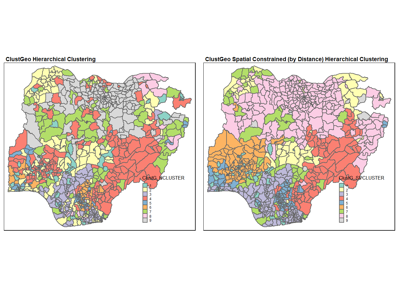
We can see that the clusters obtained by considering spatial constraints are less fragmented and has more geographical cohesion. In particular, the north west region has more geographical cohesion now (in spatially constrained hierarchical clustering).
10.3 Contiguous Neighbour Constrained Hierarchical Clustering
In this section, we will attempt to improve the geographical cohesion of the clusters using ClustGeo. To do this, we will use a different matrix of dissimilarities D1 which takes into consideration the neighborhood around each LGA account rather than using the geographical distance. In this way, LGAs with contiguous boundaries (sharing one or more boundary point) are considered as neighbours. The adjacency matrix A is the binary matrix of the neighbourhoods between the LGAs.
We will use poly2nb() from spdep package to compute the neighbours list object from the polygon list (similar to in Section 9.2).
list.nb <- poly2nb(nga_sp)We will then use nb2mat() from spdep package to generate a weights matrix for the neighbour list obtained. In here, we have specified the style to be binary, so LGAs with contiguous boundaries will have the value of 1 assigned, otherwise 0. We will also set the diagonal to be 1 to prepare for deriving the dissimilarity matrix in the subsequent step.
A <- nb2mat(list.nb, style="B")
diag(A) <- 1
The dissimilarity matrix D1 is then 1 minus A.
D1 <- as.dist(1-A)The procedure for the choice of alpha is repeated here with the new matrix D1.
cr <- choicealpha(proxmat, D1, range.alpha = seq(0, 1, 0.1), K=9, graph = TRUE)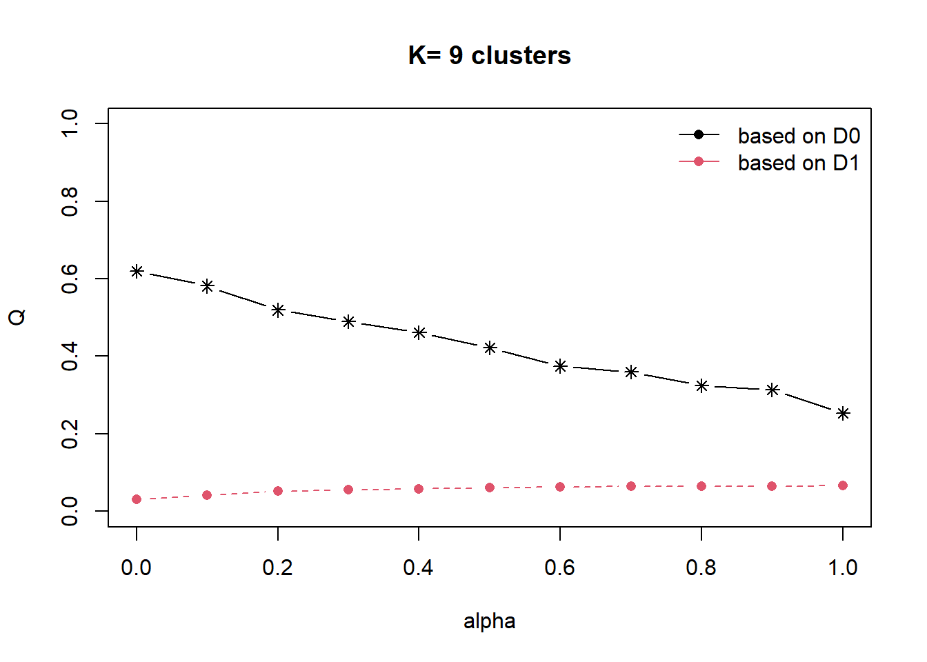
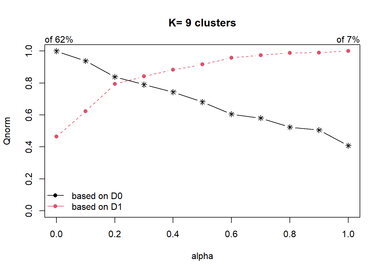
cr$Q Q0 Q1
alpha=0 0.6197622 0.03050810
alpha=0.1 0.5818355 0.04097068
alpha=0.2 0.5195099 0.05210635
alpha=0.3 0.4896591 0.05534654
alpha=0.4 0.4609872 0.05796505
alpha=0.5 0.4223039 0.06021902
alpha=0.6 0.3750095 0.06293002
alpha=0.7 0.3596016 0.06397289
alpha=0.8 0.3245149 0.06494931
alpha=0.9 0.3135455 0.06501170
alpha=1 0.2525992 0.06567767In the first plot, we can see that the explained inertia calculated with D1 (red curve) is much smaller than the explained inertia calculated with D0 (black curve). To overcome this problem, we will use the second plot, i.e. the normalized proportion of explained inertia (Qnorm) instead.
We will also obtain the normalised proportion of explained inertia using the following code chunk.
cr$Qnorm Q0norm Q1norm
alpha=0 1.0000000 0.4645125
alpha=0.1 0.9388044 0.6238144
alpha=0.2 0.8382408 0.7933648
alpha=0.3 0.7900759 0.8426995
alpha=0.4 0.7438130 0.8825687
alpha=0.5 0.6813967 0.9168873
alpha=0.6 0.6050862 0.9581646
alpha=0.7 0.5802251 0.9740433
alpha=0.8 0.5236120 0.9889101
alpha=0.9 0.5059126 0.9898600
alpha=1 0.4075744 1.0000000The plot for Qnorm and the normalised proportion of explained inertia suggests to choose alpha=0.2.
Again, we can derive the clusters and plot them on a choropleth.
clustG <- hclustgeo(proxmat, D1, alpha = 0.2)
groups <- as.factor(cutree(clustG, k=9))
nga_wp <- cbind(nga_wp, as.matrix(groups)) %>%
  rename(`ClustG_NCLUSTER` = `as.matrix.groups.`)
qtm(nga_wp, "ClustG_NCLUSTER")+
    tm_layout(main.title = "ClustGeo Neighbourhood Constrained Hierarchical Clustering",
              main.title.size = 0.7,
              main.title.fontface = "bold",
              legend.width = 0.4,
              legend.height = 0.3)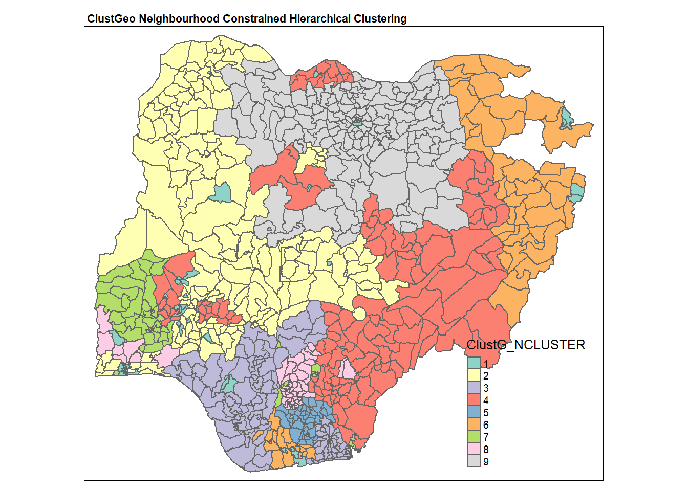
In the following code chunk, we get the summary of attribute means for each cluster.
nga_wp %>%
    st_set_geometry(NULL) %>%
    group_by(ClustG_NCLUSTER) %>%
    summarise_at(c(7,8,16,17,19,21:23), mean)
# A tibble: 9 × 9
ClustG_NCLUS…¹ wp_fu…² wp_no…³ pct_f…⁴ pct_n…⁵ pct_l…⁶ pct_r…⁷ pct_pay pct_c…⁸
<chr> <dbl> <dbl> <dbl> <dbl> <dbl> <dbl> <dbl> <dbl>
1 1 56.9 30.4 0.617 0.306 0.442 0.0890 0.831 0.145
2 2 65.7 63 0.494 0.466 0.611 0.803 0.893 0.315
3 3 17.0 29.0 0.367 0.621 0.205 0.878 0.920 0.635
4 4 77.8 68.9 0.395 0.397 0.818 0.892 0.714 0.398
5 5 20.1 31.1 0.286 0.426 0.430 0.779 0.669 0.645
6 6 26.8 7.91 0.756 0.224 0.470 0.806 0.892 0.541
7 7 39.8 34.9 0.391 0.320 0.619 0.462 0.613 0.358
8 8 12.9 11.6 0.223 0.223 0.646 0.603 0.357 0.752
9 9 164. 41.9 0.780 0.217 0.885 0.897 0.950 0.239
# … with abbreviated variable names ¹ClustG_NCLUSTER, ²wp_functional,
# ³wp_nonfunctional, ⁴pct_functional, ⁵pct_nonfunctional, ⁶pct_lowusage,
# ⁷pct_rural, ⁸pct_crucialWe also want to compare the spatially constrained hierarchical clusters and the neighbourhood constrained hierarchical clusters.
Gclust.map <- qtm(nga_wp,
                  "ClustG_SPCLUSTER") +
  tm_borders(alpha = 0.5) +
    tm_layout(main.title = "ClustGeo Spatially Constrained (Distance) Clustering",
              main.title.size = 0.6,
              main.title.fontface = "bold",
              legend.width = 0.4,
              legend.height = 0.3)

Nclust.map <- qtm(nga_wp,
                   "ClustG_NCLUSTER") +
  tm_borders(alpha = 0.5) +
    tm_layout(main.title="ClustGeo Neighbourhood Constrained (Contiguous) Clustering",
              main.title.size = 0.6,
              main.title.fontface = "bold",
              legend.width = 0.4,
              legend.height = 0.3)

tmap_arrange(Gclust.map, Nclust.map,
             asp=NA, ncol=2)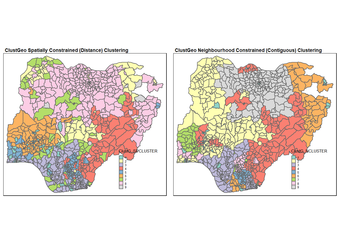
As expected, we can see that the neighbourhood constrained hierarchical clusters obtained are less fragmented compared to the spatially constrained hierarchical clusters. In particular, the geographical cohesion is improved in the region for cluster 2 (with reference to the map for neighbourhood constrained hierarchical clusters).
However, we can also observe that the clustering process using neighbourhood constrained hierarchical clustering do not give completely geographically cohesive clusters. For instance, cluster 4 is divided spatially into 4 plots. The reason for this observation is that the clustering is based on soft contiguity constraints. This results in LGAs that are not neighbours are still allowed to be in the same clusters.
Comparing the water point attribute homogeneity obtained in the 2 clustering methods, we noticed that spatially constrained (by distance) hierarchical clusters is 56% (Q0 at alpha=0.2) which is higher than neighbourhood constrained hierarchical clusters which is at 52% (Q0 at alpha=0.2). Again, this is within expectation as neighbourhood constrained hierarchical clustering compromised water point attribute homogeneity for improved geographical cohesion.
11 Visualisation of all clustering results
tmap_arrange(skclust.map, Gclust.map, Nclust.map, hclust.map, Hclust.map,
             asp=NA, ncol=3)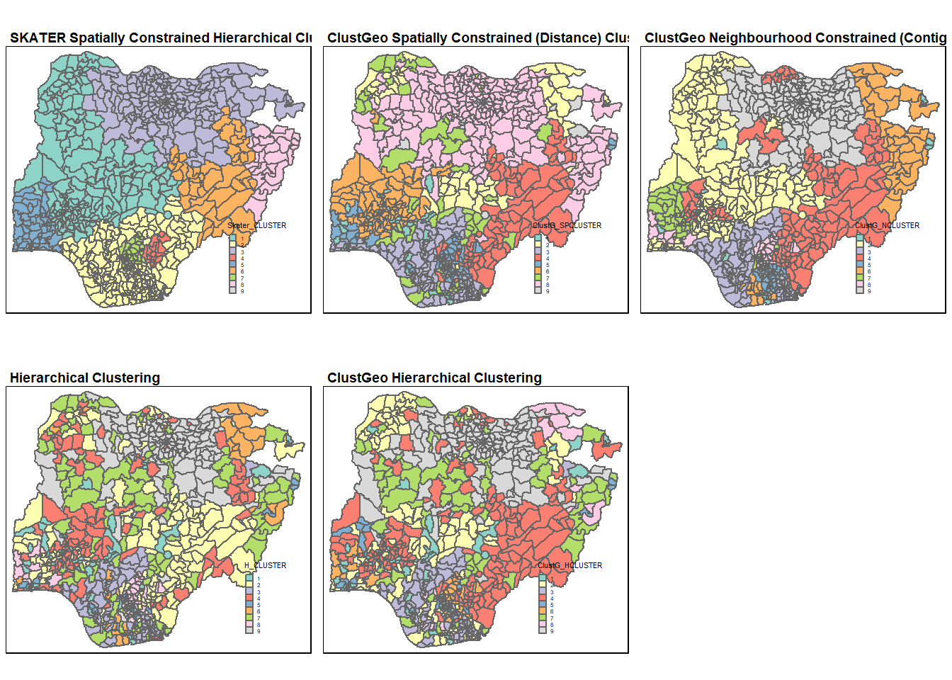
Comparing among the 3 spatially and neighbourhood constrained results, we can see that the SKATER spatially constrained hierarchical clustering gave the most geographically cohesive clusters, which is then followed by ClustGeo’s neighbourhood constrained cluster.
The results for hierarchical clustering are largely similar for both the hierarchical methods (hclust() and hclustgeo()). The only exception is at the most North West region where the LGAs are assigned to different clusters in the 2 methods.
11.1 Comparing spatially constrained and neighbourhood constrained hierarchical clusters
We will generate boxplots for each water point attribute for each cluster to perform this comparison. As such, we want to create a data frame containing just the shapeName, cluster IDs, and the water point attribute values. This will then allow us to facet by the cluster ID and subsequently generate the boxplots.
First, we will select the cluster IDs and the shapeName from nga_wp and drop the geometry field by setting it to NULL.
cluster_summary <- nga_wp %>%
    st_set_geometry(NULL) %>%
  select("shapeName", "H_CLUSTER", "Skater_CLUSTER", "ClustG_HCLUSTER", "ClustG_SPCLUSTER", "ClustG_NCLUSTER")
head(cluster_summary)
shapeName H_CLUSTER Skater_CLUSTER ClustG_HCLUSTER ClustG_SPCLUSTER
1 Aba North 1 2 1 1
2 Aba South 1 2 1 1
4 Abaji 2 1 2 2
5 Abak 3 2 3 3
6 Abakaliki 2 4 4 4
7 Abeokuta North 1 5 1 1
ClustG_NCLUSTER
1 1
2 1
4 2
5 3
6 4
7 1Next, we want to rename the IDs for each cluster field to differentiate the clusters generated from each clustering method. To do this, we use recode_factor() from dplyr package.
cluster_summary$H_CLUSTER <- recode_factor(cluster_summary$H_CLUSTER,
                                           "1" = "Hier, Cluster 1",
                                           "2" = "Hier, Cluster 2",
                                           "3" = "Hier, Cluster 3",
                                           "4" = "Hier, Cluster 4",
                                           "5" = "Hier, Cluster 5",
                                           "6" = "Hier, Cluster 6",
                                           "7" = "Hier, Cluster 7",
                                           "8" = "Hier, Cluster 8",
                                           "9" = "Hier, Cluster 9")
cluster_summary$Skater_CLUSTER <- recode_factor(cluster_summary$Skater_CLUSTER,
                                           "1" = "Skater, Cluster 1",
                                           "2" = "Skater, Cluster 2",
                                           "3" = "Skater, Cluster 3",
                                           "4" = "Skater, Cluster 4",
                                           "5" = "Skater, Cluster 5",
                                           "6" = "Skater, Cluster 6",
                                           "7" = "Skater, Cluster 7",
                                           "8" = "Skater, Cluster 8",
                                           "9" = "Skater, Cluster 9")
cluster_summary$ClustG_HCLUSTER <- recode_factor(cluster_summary$ClustG_HCLUSTER,
                                           "1" = "ClustGeo Hier, Cluster 1",
                                           "2" = "ClustGeo Hier, Cluster 2",
                                           "3" = "ClustGeo Hier, Cluster 3",
                                           "4" = "ClustGeo Hier, Cluster 4",
                                           "5" = "ClustGeo Hier, Cluster 5",
                                           "6" = "ClustGeo Hier, Cluster 6",
                                           "7" = "ClustGeo Hier, Cluster 7",
                                           "8" = "ClustGeo Hier, Cluster 8",
                                           "9" = "ClustGeo Hier, Cluster 9")
cluster_summary$ClustG_SPCLUSTER <- recode_factor(cluster_summary$ClustG_SPCLUSTER,
                                           "1" = "ClustGeo, distance Cluster 1",
                                           "2" = "ClustGeo, distance Cluster 2",
                                           "3" = "ClustGeo, distance Cluster 3",
                                           "4" = "ClustGeo, distance Cluster 4",
                                           "5" = "ClustGeo, distance Cluster 5",
                                           "6" = "ClustGeo, distance Cluster 6",
                                           "7" = "ClustGeo, distance Cluster 7",
                                           "8" = "ClustGeo, distance Cluster 8",
                                           "9" = "ClustGeo, distance Cluster 9")
cluster_summary$ClustG_NCLUSTER <- recode_factor(cluster_summary$ClustG_NCLUSTER,
                                           "1" = "ClustGeo, contiguity Cluster 1",
                                           "2" = "ClustGeo, contiguity Cluster 2",
                                           "3" = "ClustGeo, contiguity Cluster 3",
                                           "4" = "ClustGeo, contiguity Cluster 4",
                                           "5" = "ClustGeo, contiguity Cluster 5",
                                           "6" = "ClustGeo, contiguity Cluster 6",
                                           "7" = "ClustGeo, contiguity Cluster 7",
                                           "8" = "ClustGeo, contiguity Cluster 8",
                                           "9" = "ClustGeo, contiguity Cluster 9")
Next, to nga_wp.std, we will use rownames_to_column from tibble package to bring the shapeName from index column to a field column. This allows us to merge this data frame with cluster_summary by the shapeName field as shown in the following code chunk.
nga_wp.std <- tibble::rownames_to_column(nga_wp.std, "shapeName")
cluster_summary <- merge(x=cluster_summary, y=nga_wp.std,
                         by.x="shapeName", by.y="shapeName")
head(cluster_summary)
shapeName H_CLUSTER Skater_CLUSTER ClustG_HCLUSTER
1 Aba North Hier, Cluster 1 Skater, Cluster 2 ClustGeo Hier, Cluster 1
2 Aba South Hier, Cluster 1 Skater, Cluster 2 ClustGeo Hier, Cluster 1
3 Abaji Hier, Cluster 2 Skater, Cluster 1 ClustGeo Hier, Cluster 2
4 Abak Hier, Cluster 3 Skater, Cluster 2 ClustGeo Hier, Cluster 3
5 Abakaliki Hier, Cluster 2 Skater, Cluster 4 ClustGeo Hier, Cluster 4
6 Abeokuta North Hier, Cluster 1 Skater, Cluster 5 ClustGeo Hier, Cluster 1
ClustG_SPCLUSTER ClustG_NCLUSTER wp_functional
1 ClustGeo, distance Cluster 1 ClustGeo, contiguity Cluster 1 0.009308511
2 ClustGeo, distance Cluster 1 ClustGeo, contiguity Cluster 1 0.038563830
3 ClustGeo, distance Cluster 2 ClustGeo, contiguity Cluster 2 0.030585106
4 ClustGeo, distance Cluster 3 ClustGeo, contiguity Cluster 3 0.030585106
5 ClustGeo, distance Cluster 4 ClustGeo, contiguity Cluster 4 0.109042553
6 ClustGeo, distance Cluster 1 ClustGeo, contiguity Cluster 1 0.021276596
wp_nonfunctional pct_functional pct_nonfunctional pct_lowusage pct_rural
1 0.03237410 0.4117647 0.5294118 0.17647059 0.00000000
2 0.12589928 0.4084507 0.4929577 0.12676056 0.05633803
3 0.12230216 0.4035088 0.5964912 0.40350877 0.84210526
4 0.08992806 0.4791667 0.5208333 0.08333333 0.83333333
5 0.15107914 0.3519313 0.1802575 0.90557940 0.87553648
6 0.05395683 0.4705882 0.4411765 0.23529412 0.20588235
pct_pay pct_crucial
1 0.9387255 0.4705882
2 0.8679577 0.3239437
3 0.6162281 0.5614035
4 0.9348958 0.7500000
5 0.5082260 0.1502146
6 0.7855392 0.3823529We will then generate the boxplots for Skater clusters. We will need to use melt() from reshape2 package to convert cluster_summarydata frame with several measurement columns into a data frame in a canonical format, which has one row for every observed (measured) value. We set the ID of the variables, i.e. id.vars argument to the cluster ID, “Skater_CLUSTER” as shown in the following code chunk.
skmelted<- melt(cluster_summary[c(3,7:14)],id.vars="Skater_CLUSTER")
head(skmelted)
Skater_CLUSTER variable value
1 Skater, Cluster 2 wp_functional 0.009308511
2 Skater, Cluster 2 wp_functional 0.038563830
3 Skater, Cluster 1 wp_functional 0.030585106
4 Skater, Cluster 2 wp_functional 0.030585106
5 Skater, Cluster 4 wp_functional 0.109042553
6 Skater, Cluster 5 wp_functional 0.021276596We will then use facet_wrap() to generate one plot for each cluster ID by specifying the first argument as Skater_CLUSTER.
SKCLUSTER <- ggplot(skmelted,aes(x = value, y = variable)) +
     geom_boxplot()+facet_wrap(~Skater_CLUSTER,
                               nrow = 9)
We will repeat the same steps for ClustG_SPCLUSTER and ClustG_NCLUSTER. Finally, we will use ggarrange() to combine the plots together.
SPmelted<- melt(cluster_summary[c(5,7:14)],id.vars="ClustG_SPCLUSTER")
ClustG_SPCLUSTER <- ggplot(SPmelted, aes(x = value, y = variable)) +
     geom_boxplot()+facet_wrap(~ClustG_SPCLUSTER,nrow = 9)

Nmelted<- melt(cluster_summary[c(6,7:14)],id.vars="ClustG_NCLUSTER")
ClustG_NCLUSTER <- ggplot(Nmelted, aes(x = value, y = variable)) +
     geom_boxplot()+facet_wrap(~ClustG_NCLUSTER,nrow = 9)

ggarrange(SKCLUSTER, ClustG_SPCLUSTER, ClustG_NCLUSTER,
          ncol = 3)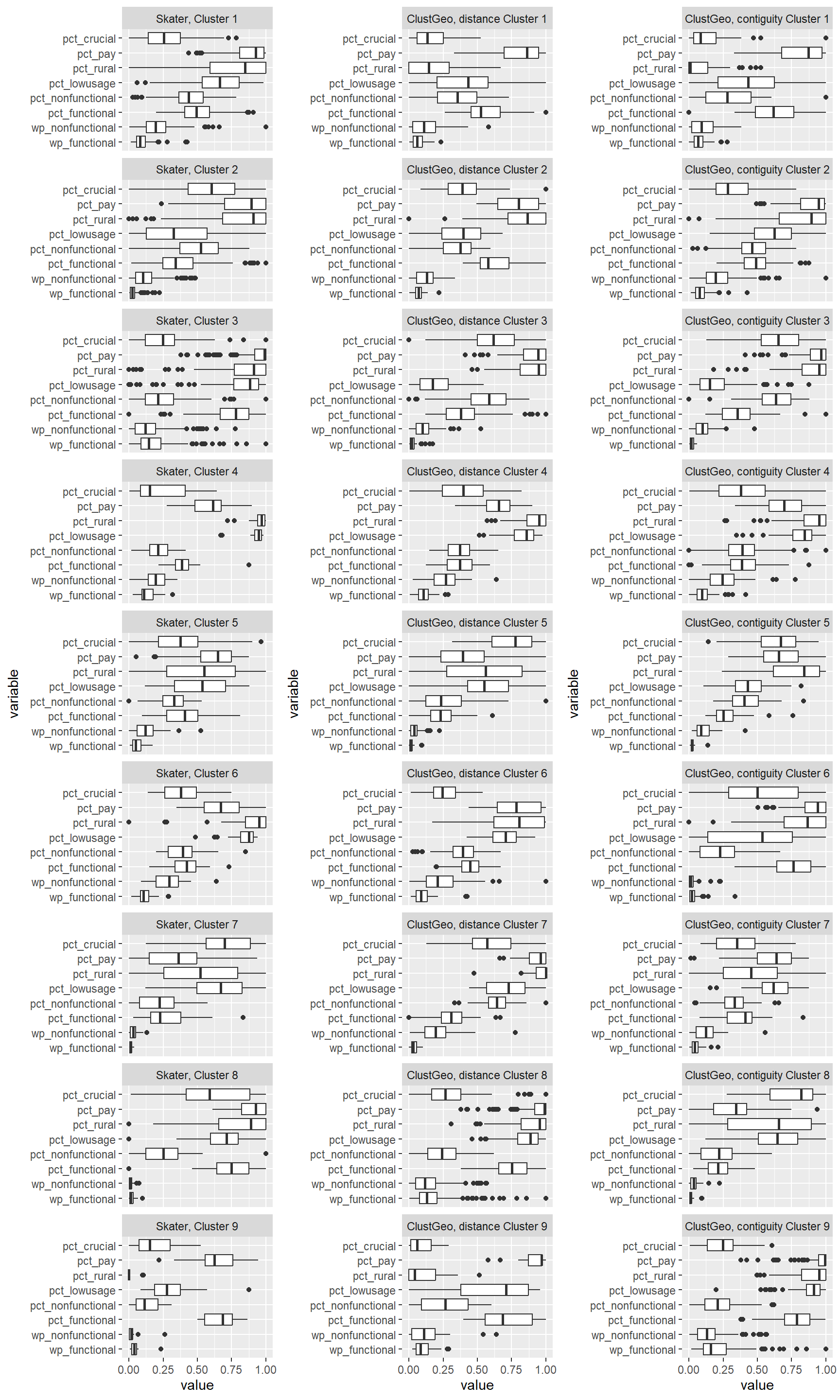
We can observe that the clusters formed using SKATER is less homogeneous compared to those formed using ClustGeo. For instance, in Skater cluster 2, we can see that LGAs belonging to this cluster has a wide range of values for pct_lowusage. Such wide range of values is observed in several skater clusters. This is within expectation as the Skater clusters are more spatially compact compared to those formed by ClustGeo.
Comparing ClustGeo distance and ClustGeo contiguity (aka neighbourhood) clusters, the boxplots are relatively similar such as ClustGeo distance clusters 3, 4, 6, and 8, resemble ClustGeo contiguity clusters 3, 4, 7, and 9 respectively. This is aligned with the water point attributes homogeneity which is similar in the 2 clustering methods, i.e. 56% and 52% for spatially constrained (by distance) hierarchical clusters and neighbourhood constrained hierarchical clusters respectively. Comparing the boxplots obtained from these 2 methods, ClustGeo distance seem to give more compact boxplots. This is aligned with expectation since ClustGeo contiguity has more spatial cohesion, and would have compromised more on water point attributes homogeneity.
11.2 Analysing cluster characteristics for ClustGeo Spatially Constrained by Distance
In the following analysis, we may make reference to the geopolitical zones in Nigeria as illustrated in the following image.
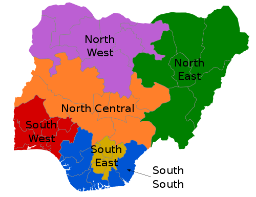
Image reference [4]
We will first generate boxplots for each cluster ID for each clustering variable. This will allow us to compare between the clusters for each variable more easily. To do this, we have listed the x-axis to be the cluster IDs (i.e. ClustG_SPCLUSTER) and y-axis to be the min-max standardised values of the attributes. Using the standardised values allows us to put all the variables on the same scale for easier visualisation. We will facet by the variable so that we generate separate plot for each variable.
ggplot(SPmelted,aes(x = ClustG_SPCLUSTER, y = value)) +
     geom_boxplot()+facet_wrap(~variable,
                               nrow = 2) +
    theme(axis.text.x=element_text(angle=45,hjust=1))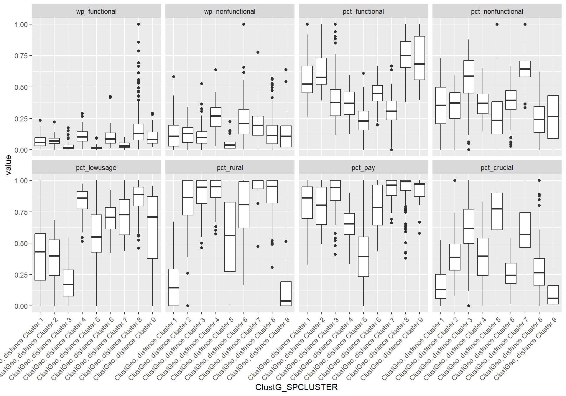
In addition, we want to generate individual map, boxplot, and summary statistics table for each cluster. We will demonstrate how this can be done for cluster 1.
First, we use mutate() to keep categorise LGAs as either “cluster 1” or “others”.
nga_wp_1 <- nga_wp %>%
    mutate(ClusterID = if_else(.$ClustG_SPCLUSTER == 1, "Cluster 1", "Others"))
We can then generate the map highlighting only the LGAs belonging to cluster 1. We have kept all the other LGAs in nga_wp_1 as “others”, allowing us to plot these non-cluster 1 LGAs on the map as well. We will let the colour of these LGAs be transparent, “#FFFFFF”.
map1 <- tm_shape(nga_wp_1) +
    tm_fill(col= "ClusterID", palette = c("blue", "#FFFFFF")) +
  tm_borders(alpha = 0.5)
To generate the boxplot for the variables for cluster 1, we need to use the min-max standardised values of the attributes found in SPmelted. We will first use filter() to get only cluster 1 data rows, before plotting the boxplot.
boxplot1 <- SPmelted %>%
    filter(ClustG_SPCLUSTER == "ClustGeo, distance Cluster 1") %>%
    ggplot(aes(x = value, y = variable)) +
     geom_boxplot() + theme(axis.text.y = element_text(size = 15))
Lastly, we will get the summary statistics for cluster 1. We will need to use the non-standardised attribute values to generate the statistics. We will first retrieve the attribute columns and the cluster ID column and save the results in cluster. We will also set geometry to NULL as we do not need the column here. We will then filter() to get the data for cluster 1 only.
cluster <- nga_wp %>%
    select(c(7,8,16,17,19,21,22,23,27)) %>%
    st_set_geometry(NULL)
clust1 <- cluster %>%
    filter(.$ClustG_SPCLUSTER == 1) %>%
    select(c(1:8))
We can efficiently get the summary statistics (min, Q1, median, Q3, and max) by using boxplot() and its attributes stats. We then use colnames() and rownames() to label each variable and each statistic respectively. we then use t() to transpose the data to make the columns to rows and vice versa for easier reading. Finally, we round of the results to 2 decimal places using round().
summary1 <- boxplot(clust1, plot=FALSE)$stats
colnames(summary1) <- c("wp_functional", "wp_nonfunctional",
                        "pct_functional", "pct_nonfunctional",
                        "pct_lowusage", "pct_rural", "pct_pay",
                        "pct_crucial")
rownames(summary1)<-c("Min","Q1","Median","Q3","Max")
summary1 <- t(summary1) %>%
    round(digits = 2)
Lastly, we use kable() to format the summary statistics table in a tidy format.
summary1 <- kable(summary1, linesep = "") %>%
    kable_styling(font_size = 10)
Analysis for Cluster 1
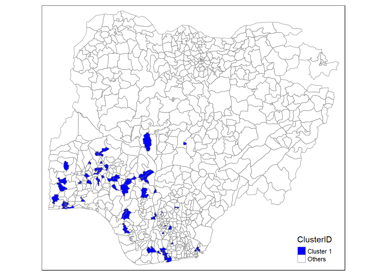
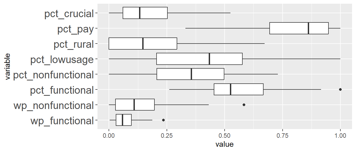
| Min | Q1 | Median | Q3 | Max | |
|---|---|---|---|---|---|
| wp_functional | 2.00 | 23.00 | 44.00 | 73.00 | 141.00 |
| wp_nonfunctional | 0.00 | 8.00 | 30.00 | 54.50 | 120.00 |
| pct_functional | 0.26 | 0.45 | 0.52 | 0.67 | 0.92 |
| pct_nonfunctional | 0.00 | 0.21 | 0.36 | 0.50 | 0.73 |
| pct_lowusage | 0.00 | 0.21 | 0.43 | 0.58 | 1.00 |
| pct_rural | 0.00 | 0.00 | 0.15 | 0.29 | 0.67 |
| pct_pay | 0.36 | 0.71 | 0.87 | 0.95 | 1.00 |
| pct_crucial | 0.00 | 0.06 | 0.13 | 0.25 | 0.52 |
The LGAs in this cluster has low pct_rural and high pct_pay which corresponds to low percentage of water points in rural areas and high percentage of water points that require payment.
Analysis for Cluster 2
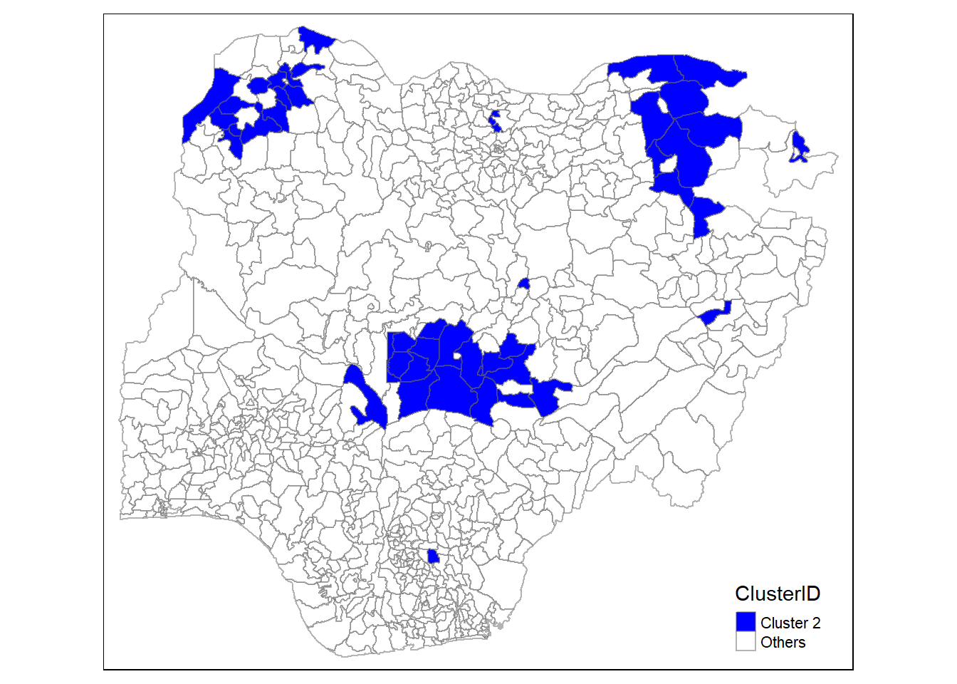
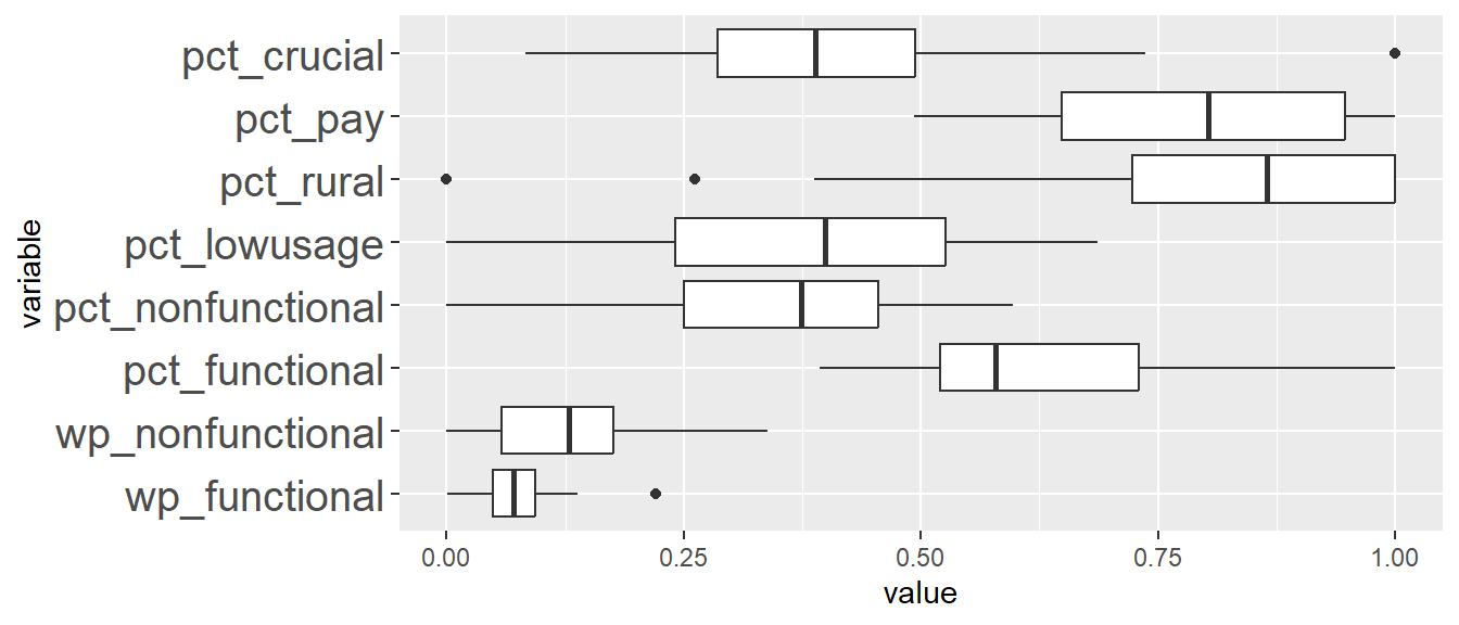
| Min | Q1 | Median | Q3 | Max | |
|---|---|---|---|---|---|
| wp_functional | 1.00 | 37.00 | 53.00 | 70.00 | 104.00 |
| wp_nonfunctional | 0.00 | 16.00 | 36.00 | 49.00 | 94.00 |
| pct_functional | 0.39 | 0.52 | 0.58 | 0.73 | 1.00 |
| pct_nonfunctional | 0.00 | 0.25 | 0.37 | 0.46 | 0.60 |
| pct_lowusage | 0.00 | 0.24 | 0.40 | 0.53 | 0.69 |
| pct_rural | 0.39 | 0.72 | 0.86 | 1.00 | 1.00 |
| pct_pay | 0.51 | 0.66 | 0.81 | 0.95 | 1.00 |
| pct_crucial | 0.08 | 0.29 | 0.39 | 0.49 | 0.74 |
The LGAs here are characterise by having relatively low percentage of water points that are over-utilised (based on low pct_lowusage), and relatively higher percentage of functional water points (pct_functional). The LGAs here occupy parts of the North West, North East, and North Central regions in Nigeria.
Analysis for Cluster 3
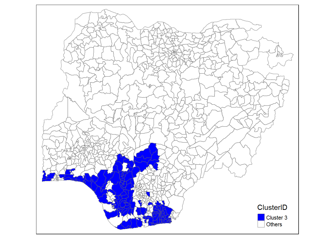
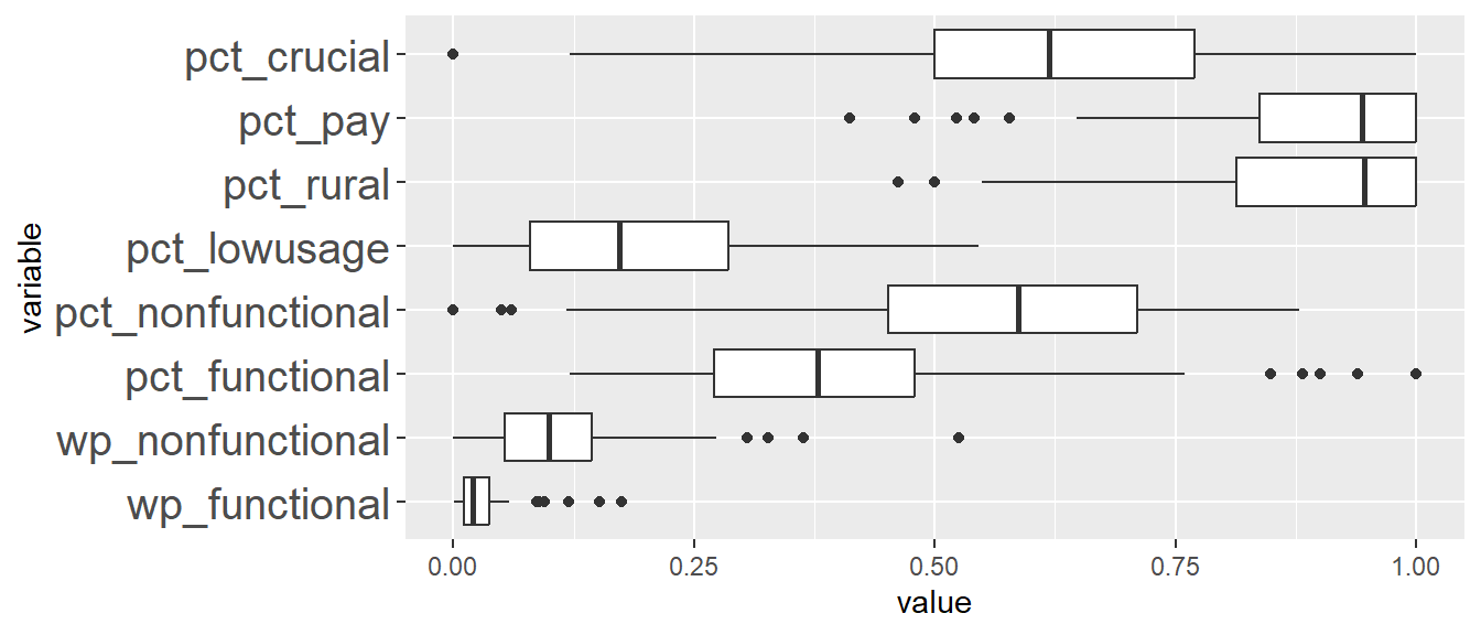
| Min | Q1 | Median | Q3 | Max | |
|---|---|---|---|---|---|
| wp_functional | 1.00 | 8.00 | 15.50 | 28.50 | 44.00 |
| wp_nonfunctional | 0.00 | 14.50 | 27.50 | 40.00 | 76.00 |
| pct_functional | 0.12 | 0.27 | 0.38 | 0.48 | 0.76 |
| pct_nonfunctional | 0.06 | 0.45 | 0.59 | 0.71 | 0.88 |
| pct_lowusage | 0.00 | 0.08 | 0.17 | 0.29 | 0.55 |
| pct_rural | 0.55 | 0.81 | 0.95 | 1.00 | 1.00 |
| pct_pay | 0.66 | 0.84 | 0.95 | 1.00 | 1.00 |
| pct_crucial | 0.12 | 0.50 | 0.62 | 0.78 | 1.00 |
The LGAs in this cluster is characterised by high percentage of non-functional water points (pct_nonfunctional) and also a high percentage of water points in the rural areas (pct_rural). The LGAs in this cluster is also characterised as having the lowest median for percentage of water points that are low usage (pct_lowusage). This is interesting as the LGAs here are mainly in the South South region, which is the urban region in Nigeria. The observation that there is a high proportion of water points that are in rural area indicates that there are possibly rural settlements within the urban South South region and could likely be due to rural-to-urban migration. Moreover, the high percentage of water points serving more than 50% of its total local population within a 1km radius of the water point (pct_crucial) indicates that the local population depends heavily on these water points.
Analysis for Cluster 4
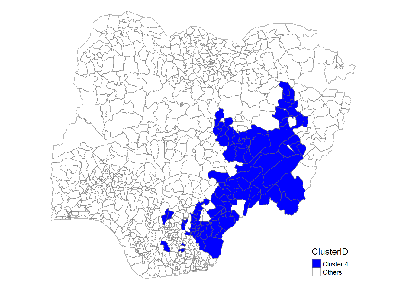
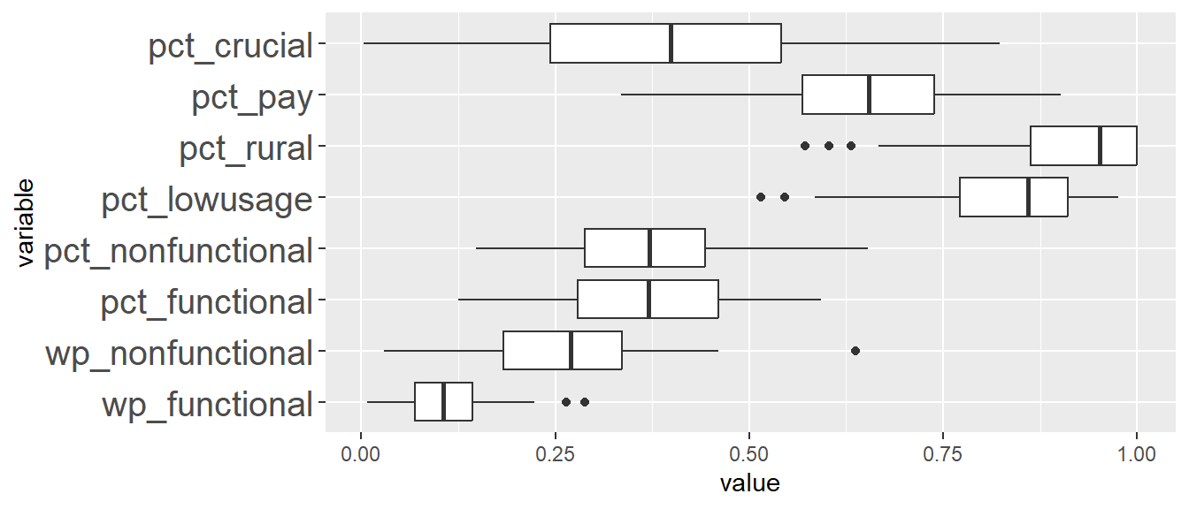
| Min | Q1 | Median | Q3 | Max | |
|---|---|---|---|---|---|
| wp_functional | 6.00 | 52.00 | 79.00 | 107.50 | 168.00 |
| wp_nonfunctional | 8.00 | 51.00 | 75.00 | 93.50 | 128.00 |
| pct_functional | 0.12 | 0.28 | 0.37 | 0.46 | 0.59 |
| pct_nonfunctional | 0.15 | 0.29 | 0.37 | 0.44 | 0.65 |
| pct_lowusage | 0.58 | 0.77 | 0.86 | 0.91 | 0.98 |
| pct_rural | 0.67 | 0.86 | 0.95 | 1.00 | 1.00 |
| pct_pay | 0.36 | 0.59 | 0.67 | 0.75 | 0.91 |
| pct_crucial | 0.00 | 0.24 | 0.40 | 0.54 | 0.82 |
The LGAs here are characterised as having the second highest (median for) percentage of water points that are of low usage (pct_lowusage) as well as relatively lower percentage of water points that are require payment for use (pct_pay).
Analysis for Cluster 5
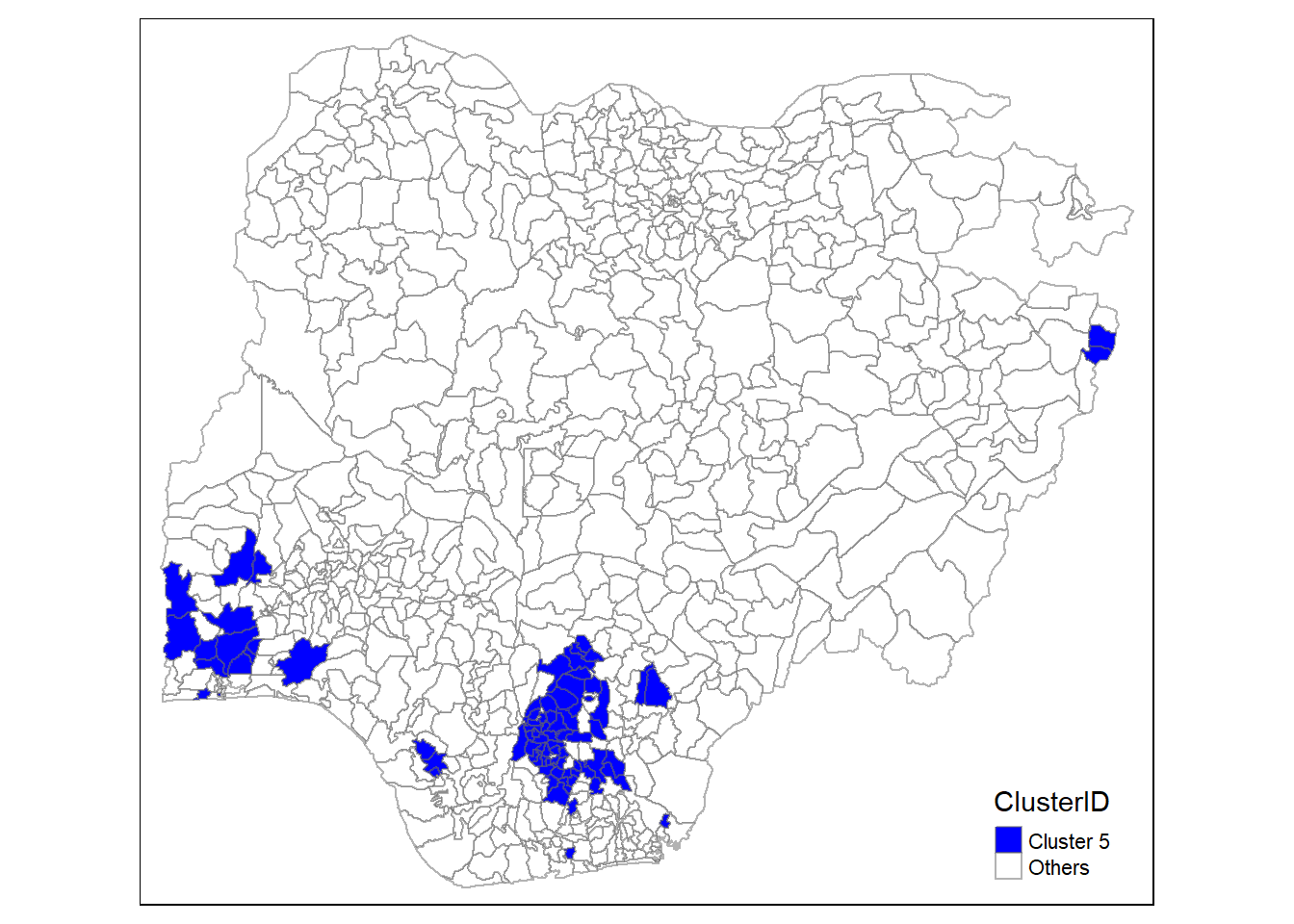
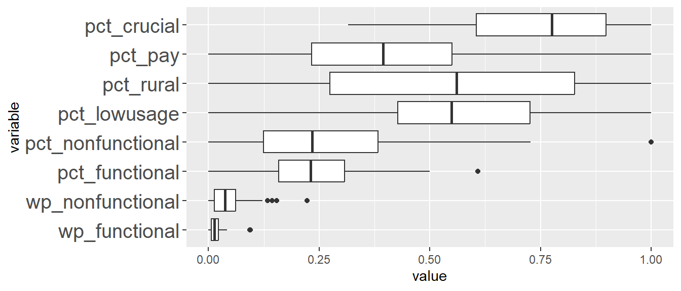
| Min | Q1 | Median | Q3 | Max | |
|---|---|---|---|---|---|
| wp_functional | 0.00 | 5.00 | 10.50 | 17.50 | 32.00 |
| wp_nonfunctional | 0.00 | 3.50 | 10.50 | 17.00 | 37.00 |
| pct_functional | 0.00 | 0.16 | 0.23 | 0.31 | 0.50 |
| pct_nonfunctional | 0.00 | 0.12 | 0.23 | 0.38 | 0.73 |
| pct_lowusage | 0.00 | 0.42 | 0.55 | 0.73 | 1.00 |
| pct_rural | 0.00 | 0.27 | 0.56 | 0.83 | 1.00 |
| pct_pay | 0.04 | 0.26 | 0.42 | 0.57 | 1.00 |
| pct_crucial | 0.32 | 0.60 | 0.78 | 0.90 | 1.00 |
The LGAs in this cluster are characterised as having the lowest median for the percentage of waterpoints that require payment for use (pct_pay) and the lowest median for the number of functional and the lowest median for the number non-functional water points (wp_functional and wp_nonfunctional). The percentage of water point in rural areas vary very widely in this cluster. Like cluster 3, cluster 5 also has a very high percentage of water points that are crucial (pct_crucial).
About half of the LGAs in this cluster is in the South East region and another half of them in the South West region in Nigeria. Considering their proximity to the South South region, attribute like pct_crucial is quite similar to cluster 3, which again indicates that the local population depends heavily on these water points within this urban South East region. One apparent difference is that cluster 5 has a much higher percentage of water points that are of low usage (i.e. % water points serving beyond their capacity) compared to cluster 3. This indicates that while water points are important and serving more than 50% of the local population, the water points are still being utilized within their capacity in cluster 5, unlike in cluster 3.
Analysis for Cluster 6
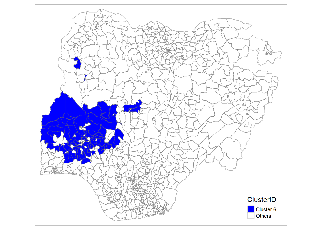
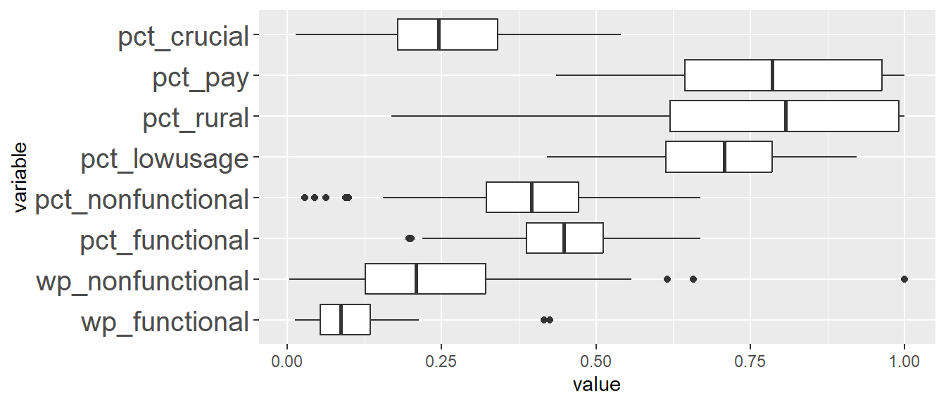
| Min | Q1 | Median | Q3 | Max | |
|---|---|---|---|---|---|
| wp_functional | 9.00 | 40.00 | 65.00 | 101.00 | 160.00 |
| wp_nonfunctional | 1.00 | 35.00 | 58.00 | 91.00 | 171.00 |
| pct_functional | 0.20 | 0.39 | 0.45 | 0.51 | 0.67 |
| pct_nonfunctional | 0.09 | 0.32 | 0.40 | 0.48 | 0.67 |
| pct_lowusage | 0.42 | 0.61 | 0.71 | 0.79 | 0.92 |
| pct_rural | 0.17 | 0.62 | 0.81 | 0.99 | 1.00 |
| pct_pay | 0.46 | 0.66 | 0.79 | 0.97 | 1.00 |
| pct_crucial | 0.01 | 0.18 | 0.25 | 0.35 | 0.54 |
The LGAs in this cluster has a moderate percentage of functional and non-function water points compared to the other clusters (i.e. pct_functional and pct_nonfunctional). The mean percentage for pct_functional and pct_nonfunctional are 44.8% and 39.1% based on summary results in Section 11.2. The LGAs in this cluster also have a relatively low pct_crucial.
Most of the LGAs in this region is in the South West region in Nigeria.
Analysis for Cluster 7
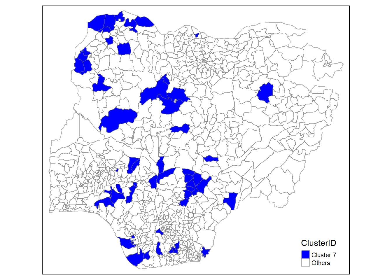
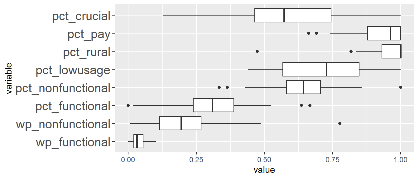
| Min | Q1 | Median | Q3 | Max | |
|---|---|---|---|---|---|
| wp_functional | 0.00 | 15.50 | 24.00 | 41.00 | 77.00 |
| wp_nonfunctional | 2.00 | 32.00 | 54.00 | 74.50 | 135.00 |
| pct_functional | 0.02 | 0.24 | 0.31 | 0.39 | 0.52 |
| pct_nonfunctional | 0.43 | 0.58 | 0.64 | 0.71 | 0.86 |
| pct_lowusage | 0.44 | 0.57 | 0.73 | 0.85 | 1.00 |
| pct_rural | 0.84 | 0.93 | 1.00 | 1.00 | 1.00 |
| pct_pay | 0.75 | 0.88 | 0.96 | 1.00 | 1.00 |
| pct_crucial | 0.13 | 0.46 | 0.57 | 0.74 | 1.00 |
The LGAs in this cluster has the highest percentage of water points that are in rural areas (pct_rural) and highest percentage of water points that are non-functional (pct_nonfunctional). They also have one of the lowest percentage of water points that are functional (pct_functional). LGAs in this cluster are relatively spatially distributed across Nigeria.
Analysis for Cluster 8
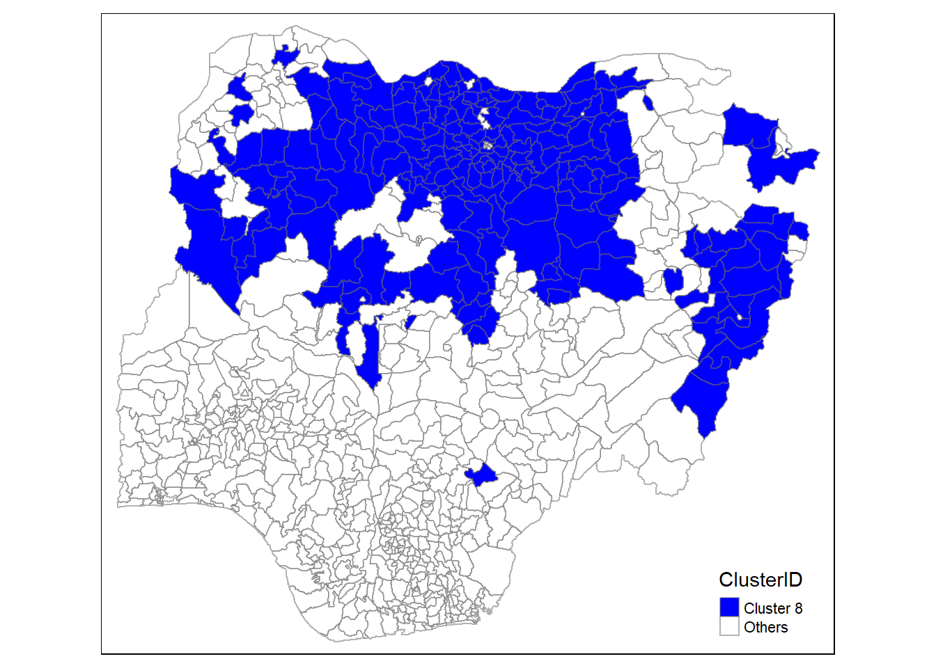
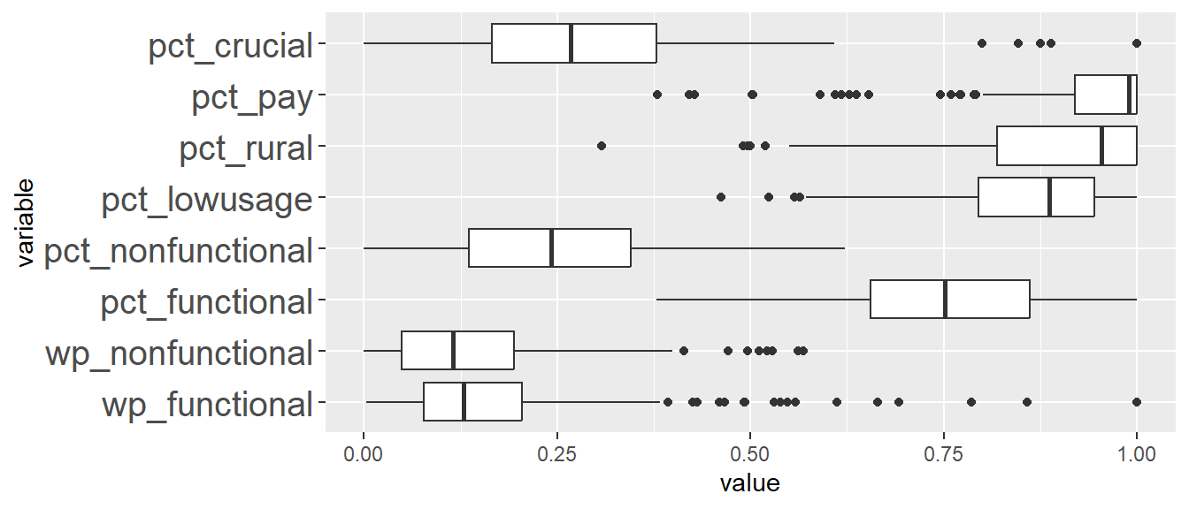
| Min | Q1 | Median | Q3 | Max | |
|---|---|---|---|---|---|
| wp_functional | 2.00 | 58.50 | 97.00 | 153.50 | 296.00 |
| wp_nonfunctional | 0.00 | 13.50 | 32.00 | 54.00 | 111.00 |
| pct_functional | 0.38 | 0.65 | 0.75 | 0.86 | 1.00 |
| pct_nonfunctional | 0.00 | 0.14 | 0.24 | 0.35 | 0.62 |
| pct_lowusage | 0.57 | 0.80 | 0.89 | 0.95 | 1.00 |
| pct_rural | 0.55 | 0.82 | 0.95 | 1.00 | 1.00 |
| pct_pay | 0.81 | 0.92 | 0.99 | 1.00 | 1.00 |
| pct_crucial | 0.00 | 0.17 | 0.27 | 0.38 | 0.61 |
The LGAs in this cluster are characterised by having the highest percentage of functional water points (pct_functional). This cluster of LGAs also has the highest median for the number of functional water points (wp_functional). There are also many outlier LGAs in this cluster with very high number of functional water points. From the map, the LGAs in this cluster mainly occupy the North West and North East regions in Nigeria which we have gathered from Take-Home Exercise 1 that these are more rural parts of Nigeria.
Analysis for Cluster 9
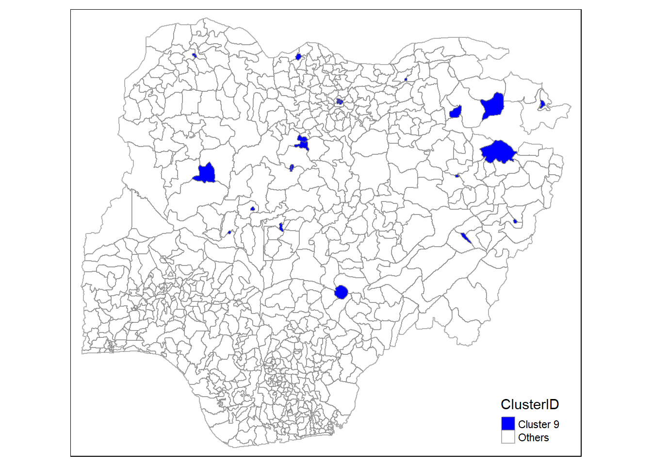
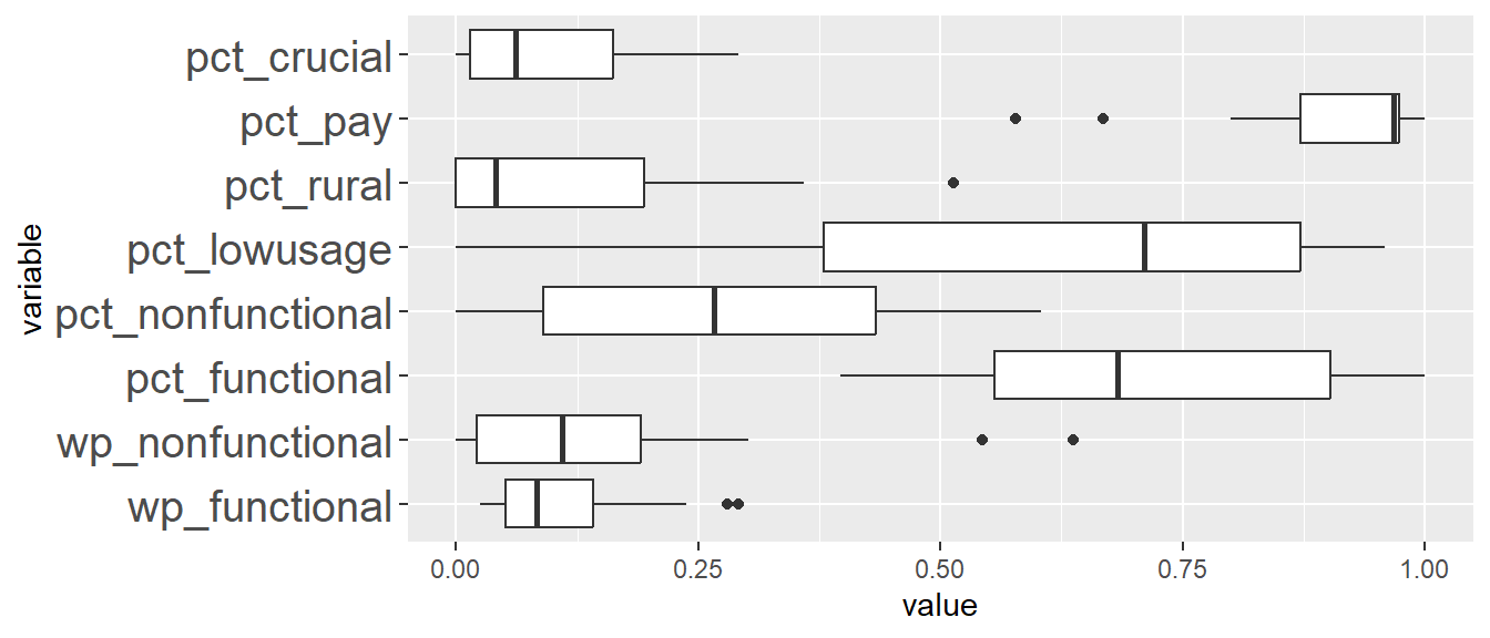
| Min | Q1 | Median | Q3 | Max | |
|---|---|---|---|---|---|
| wp_functional | 1.000 | 8.000 | 15.500 | 28.500 | 44.000 |
| wp_nonfunctional | 0.000 | 14.500 | 27.500 | 40.000 | 76.000 |
| pct_functional | 0.121 | 0.270 | 0.378 | 0.479 | 0.760 |
| pct_nonfunctional | 0.061 | 0.449 | 0.586 | 0.712 | 0.879 |
| pct_lowusage | 0.000 | 0.079 | 0.173 | 0.286 | 0.545 |
| pct_rural | 0.549 | 0.813 | 0.946 | 1.000 | 1.000 |
| pct_pay | 0.661 | 0.843 | 0.946 | 1.000 | 1.000 |
| pct_crucial | 0.121 | 0.499 | 0.619 | 0.775 | 1.000 |
The LGAs in this cluster is the most spatially distributed compared to all the other clusters. The LGAs here have the lowest percentage of water points in rural areas (pct_rural) and lowest percentage of water points are serving more than 50% of its total local population within a 1km radius of the water point (pct_crucial).
12 References
[1] Use case for regionalisation
[2] Data Wrangling steps for Take-Home Exercise 1